BoursoBank
Launched in 1998, BoursoBank is a pioneer and leader in its three main activities: online banking, online brokerage and financial information on the Internet.
BoursoBank is a 100% online bank. It is distinguished by a wide range of banking services, including life insurance, different types of credit and a range of savings products. The company focuses its marketing communication on low banking fees and 100% mobile offers.
MY ROLE
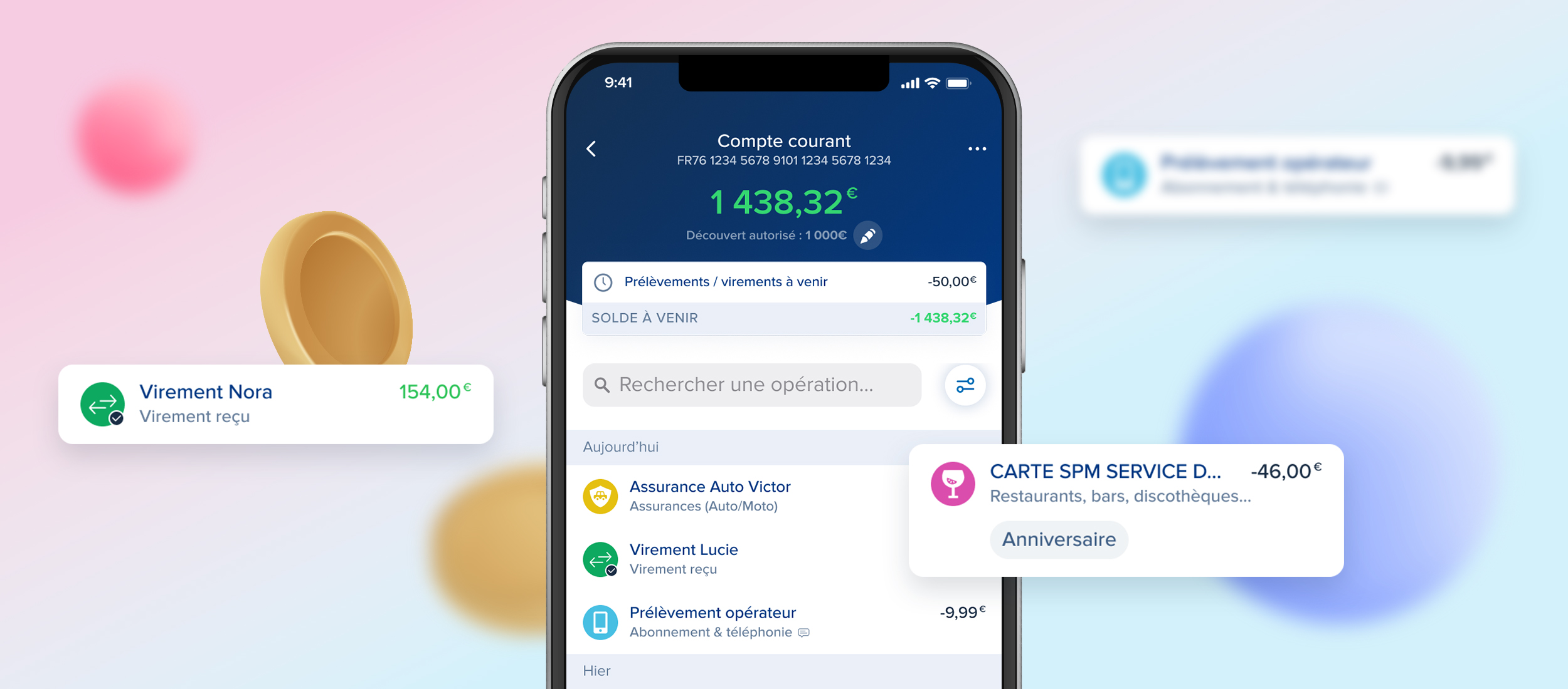
Within the marketing department, I hold the position of UI/UX in the Credit team. I work on the interfaces of 3 products: Personal loans, CLI€ financing and mylombard credit. I am in charge of producing landing pages, improving the subscription process, optimizing and creating app screens. I also create displays and communication campaigns.
In collaboration with the Design team, I update the Design System and documentation.
Branding
Bank
In order to increase awareness of products and services, BoursoBank communicates daily on the sites and the application.
Various locations are provided to promote visibility of assets.
BouroBank communicates on several sites and environments:
Not connected
Portal: website on economic, political and social news in particular
Showcase: the unconnected space of the bank site where the products and services are presented
Connected
Bank customer area: the customer accesses his accounts, offers, products and services
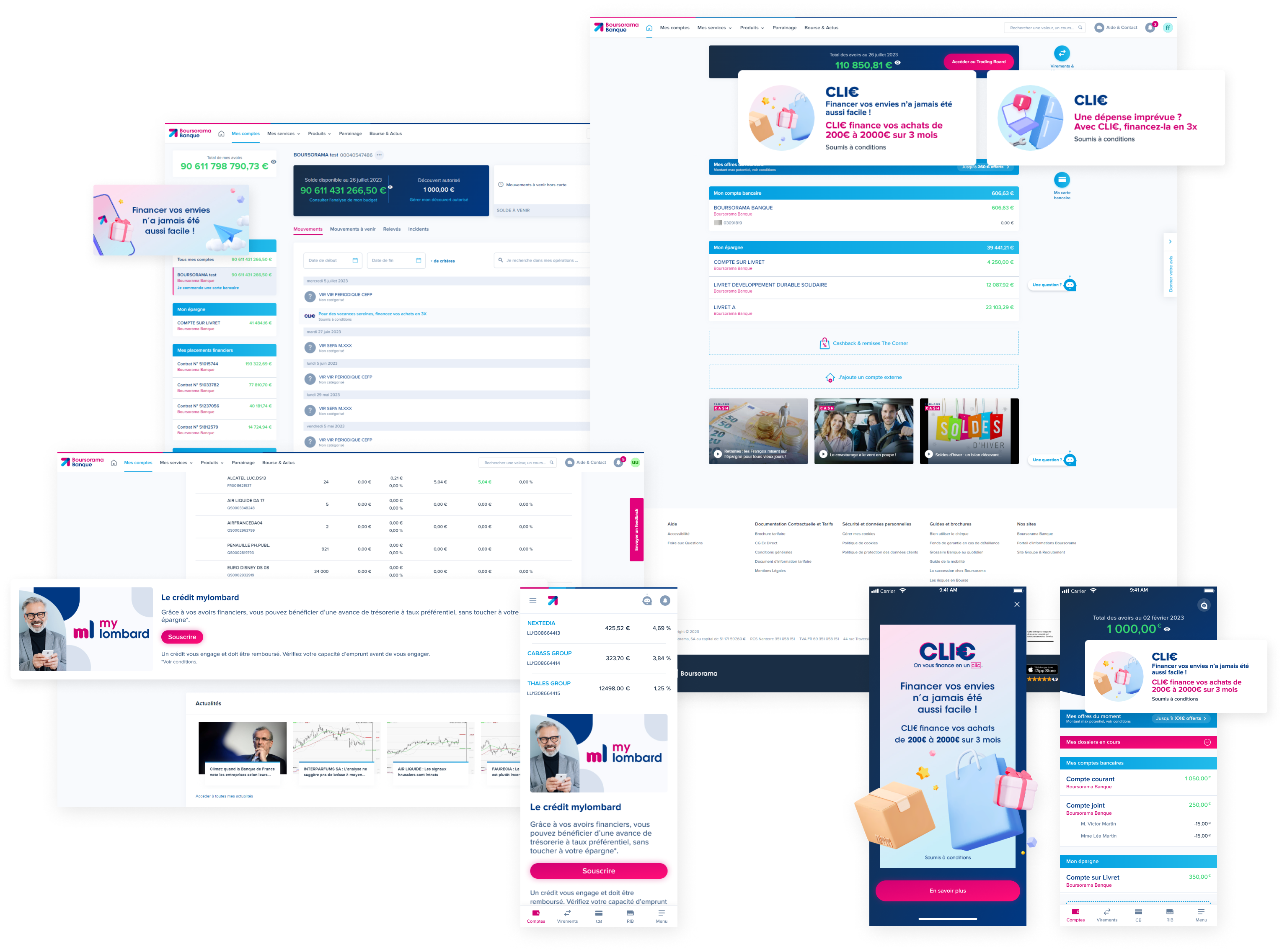
Portal
The Boursorama portal is the leading website in France for economic and financial news with more than 34 million visits per month.
Popular with Internet users for the richness of its content linked to current events (Economy, Politics, Society, Consumption), Boursorama brings together more than 900,000 unique visitors every day with a particular affinity for Finance professionals and male targets. CSP+.
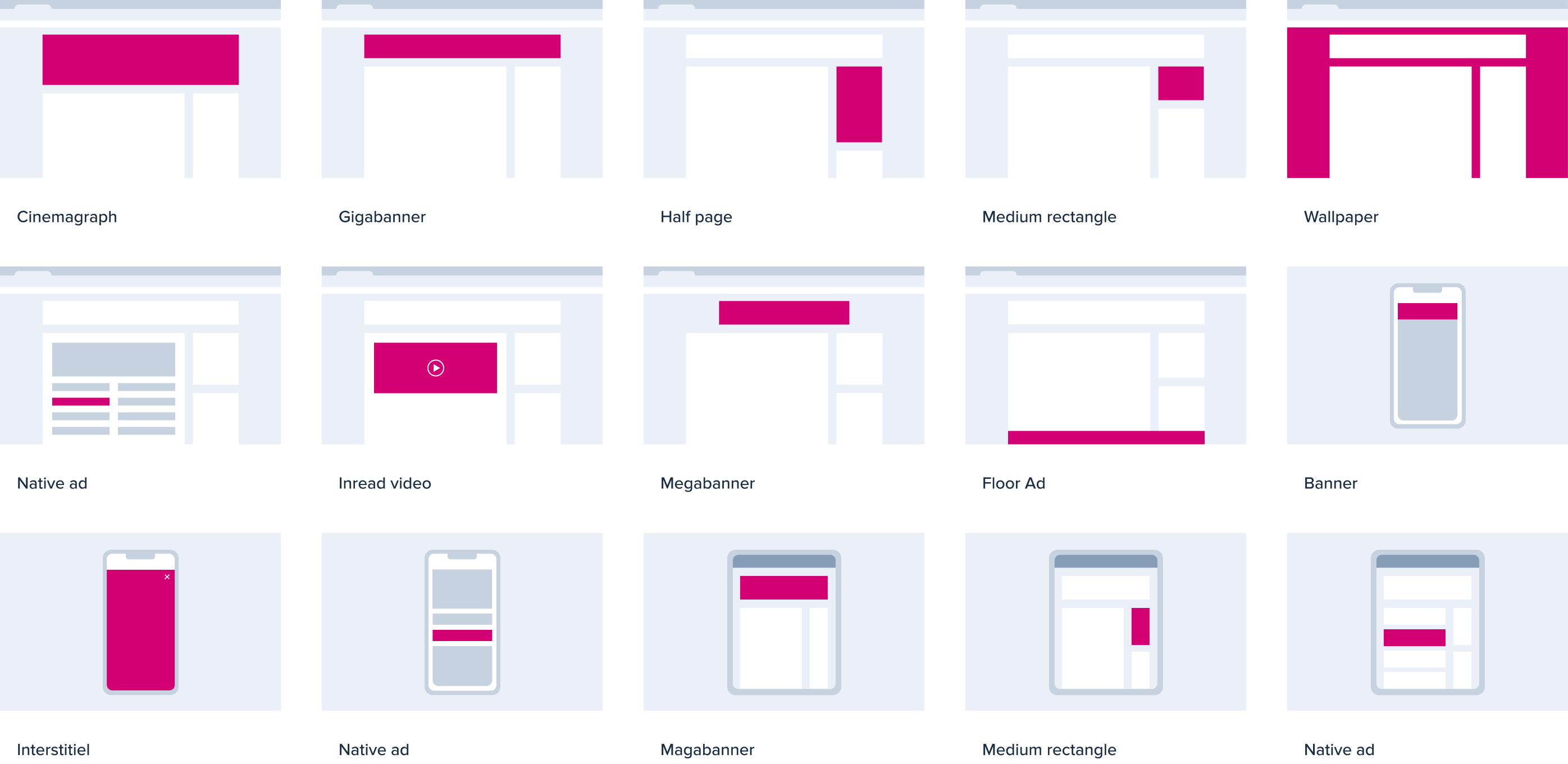
By relying on this powerful and qualitative audience, Boursorama offers advertisers effective, targeted and innovative communication solutions.
Below is an overview of the formats offered.
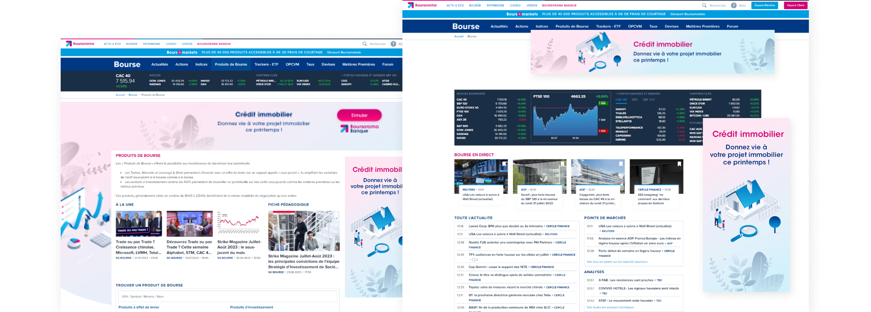
These locations can also be used to highlight internal products, such as real estate loans, stock market or savings products.
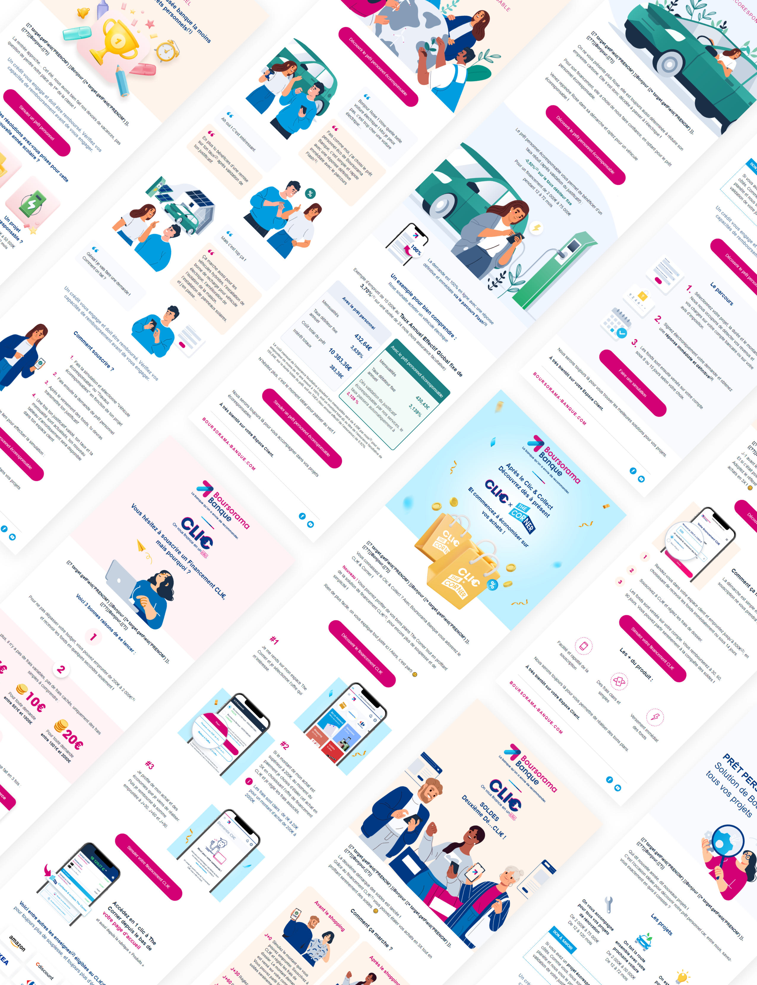
Emails are sent regularly to support production.
Focused on key moments, the products are pushed to support the customer in their moments of life.
For example, below is a communication plan for the personal loan and CLI€ financing. Emails are sent and displays displayed to specific targets so as not to overwhelm customers.

Motion
Short animation
For certain projects, animations are designed to dress the pages and displays. The short motions are vector and in Lottie format in order to maintain good quality regardless of the screen resolution while optimizing weight.
For example, an overview of the Lotties produced to highlight the products in an annual communication summarizing all the highlights of a year.
Eco-responsible loan
The Corner
Private Equity
Tutorial
Explanatory videos are also posted online to guide and reassure the customer in their subscription.
Certain products, such as personal loans, require the subscription steps to be displayed in detail.
This content is legal and must appear on the site. The texts are generally very long and difficult for readers to digest. In order to save space on the pages and provide more attractive content, certain legal content is in the form of a tutorial.
CLI€ financing
Personal loan