BoursoBank
Launched in 1998, BoursoBank is a pioneer and leader in its three main activities: online banking, online brokerage and financial information on the Internet.
BoursoBank is a 100% online bank. It is distinguished by a wide range of banking services, including life insurance, different types of credit and a range of savings products. The company focuses its marketing communication on low banking fees and 100% mobile offers.

MY ROLE
Within the marketing department, I hold the position of UI/UX in the Credit team. I work on the interfaces of 3 products: Personal loans, CLI€ financing and mylombard credit. I am in charge of producing landing pages, improving the subscription process, optimizing and creating app screens. I also create displays and communication campaigns.
In collaboration with the Design team, I update the Design System and documentation.
Interface
Each year, numerous projects are set to respond to marketing strategies and meet business challenges. For example, a total redesign of product pages or the creation of new services have been developed.
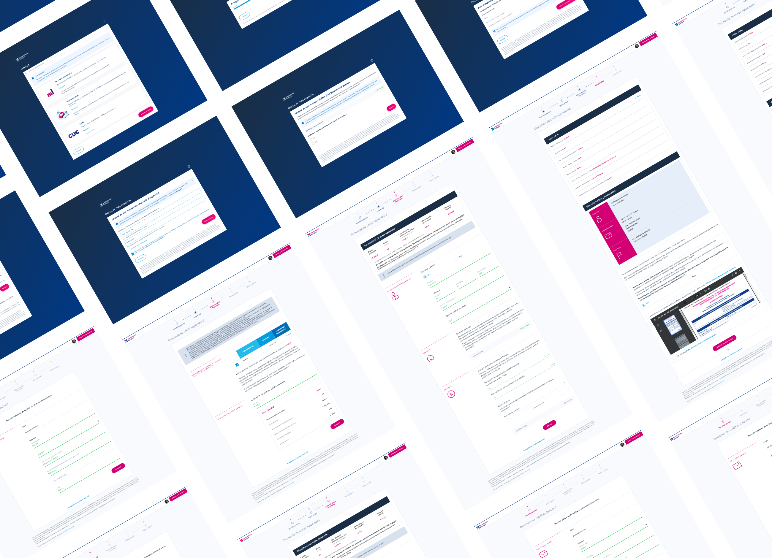
Regarding credit projets, I worked in particular on a project to automate income calculation, on the evolution of the personal loan simulator, or on an update of the subscription process.
Below is an overview of a project to promote the CLI€ payment solution and a project to optimize the mylombard credit subscription process.
Workflow
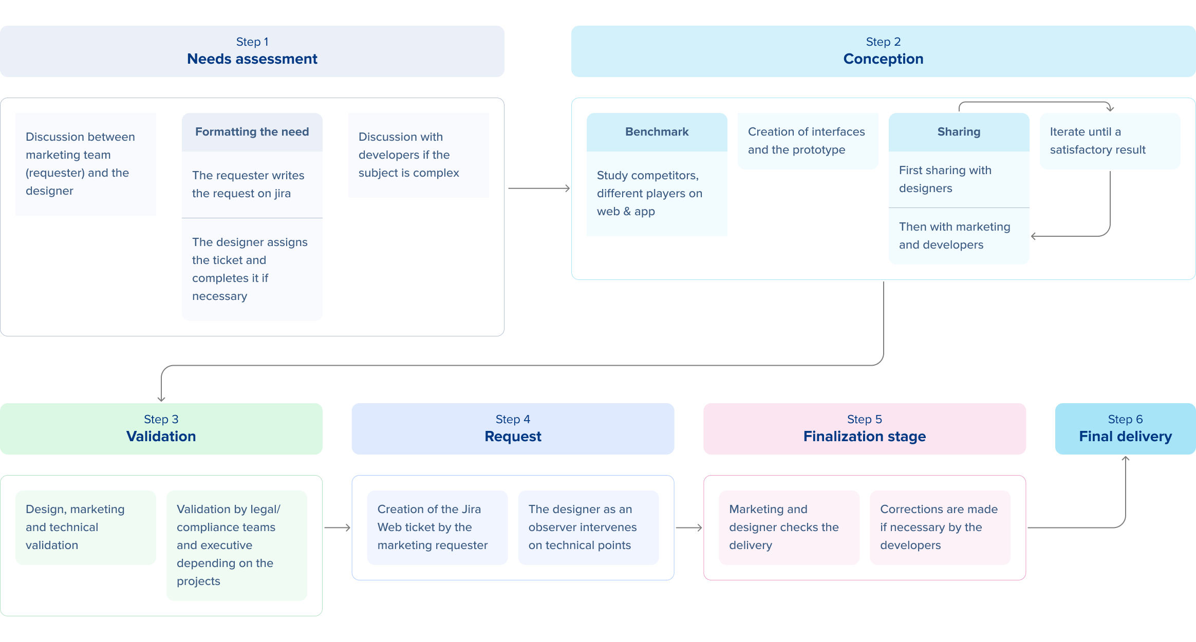

CLI€ financing allows you to deal with an unforeseen event or simply to make favorite purchases by facilitating payments from €200 to €2,000. The request is made completely online and the funds are paid immediately or within 14 days. Fees apply depending on the amount borrowed.
GOALS
Integrate the possibility of paying via CLI€ financing into The Corner browser in order to:
– Facilitate access to CLI€
– Create new product entry points
– Get as close as possible to the promotion of BNPL by e-retailers
MY ROLE
– Create interfaces and prototypes that meet business needs
– Take into account design, technical and legal constraints
– Get as close as possible to the existing browser so as not to distort it
Context
Accessible from The Corner within the application, BoursoBank’s own browser allows you to benefit from a better customer experience for e-commerce purchases from partner brands on off-the-shelf sites which offer a discount in the form of cashback or discounts immediate: Hotels.com, Booking, Promosejours, Cdiscount, Samsung, HP…
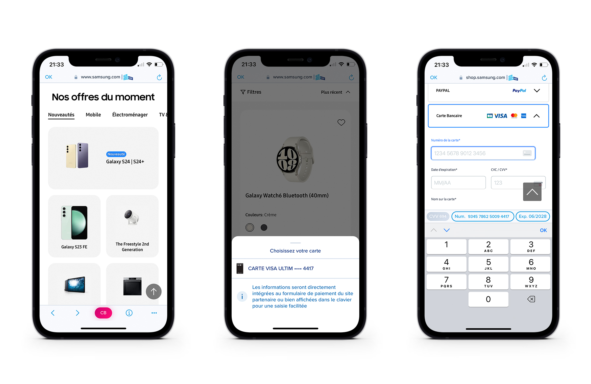
The main functionality that this browser has is 1-click credit card payment.
The principle is simple:
1. At the time of payment the customer can choose their card via the CB button or directly from the keyboard.
2. After a first authentication, the information of the chosen card is directly included in the payment form if it is correctly detected / filled in by the merchant. If this is not the case, the information is entered in the keyboard and can be copied and pasted.
3. The customer can thus make the payment without having to take out their credit card or remember the card information including the CVV unlike the Google functionality for example which requires knowing and completing their CVV.
This functionality aims to:
– Facilitate the act of purchasing (avoid searching for your card)
– Promote the use of BoursoBank payment methods
Constraints
– In order to determine the customer’s eligibility, their bank account is analyzed. In our case, the customer does not select his account but a card. In the back, the card allows you to find the linked account and carry out the analysis.
– A card must be selected first in order to save the data so that it can be pasted at the time of payment.
– The amount of the current basket cannot be identified. Technically, it is impossible to retrieve this data from partner sites.
– A customer cannot combine several CLI€ financings.
Solution
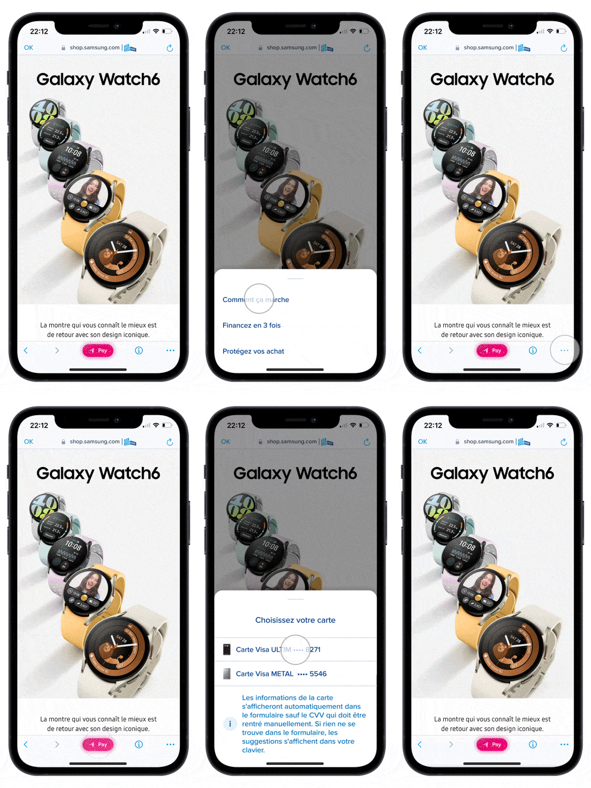
The browser is composed of:
– Pay button: Opening the sheet
– Info button: Reminder on the use of the navicorner and focus on two products: CLI€ and Bourso Protect (insurance).
– Meatball: Referral to The Corner environments
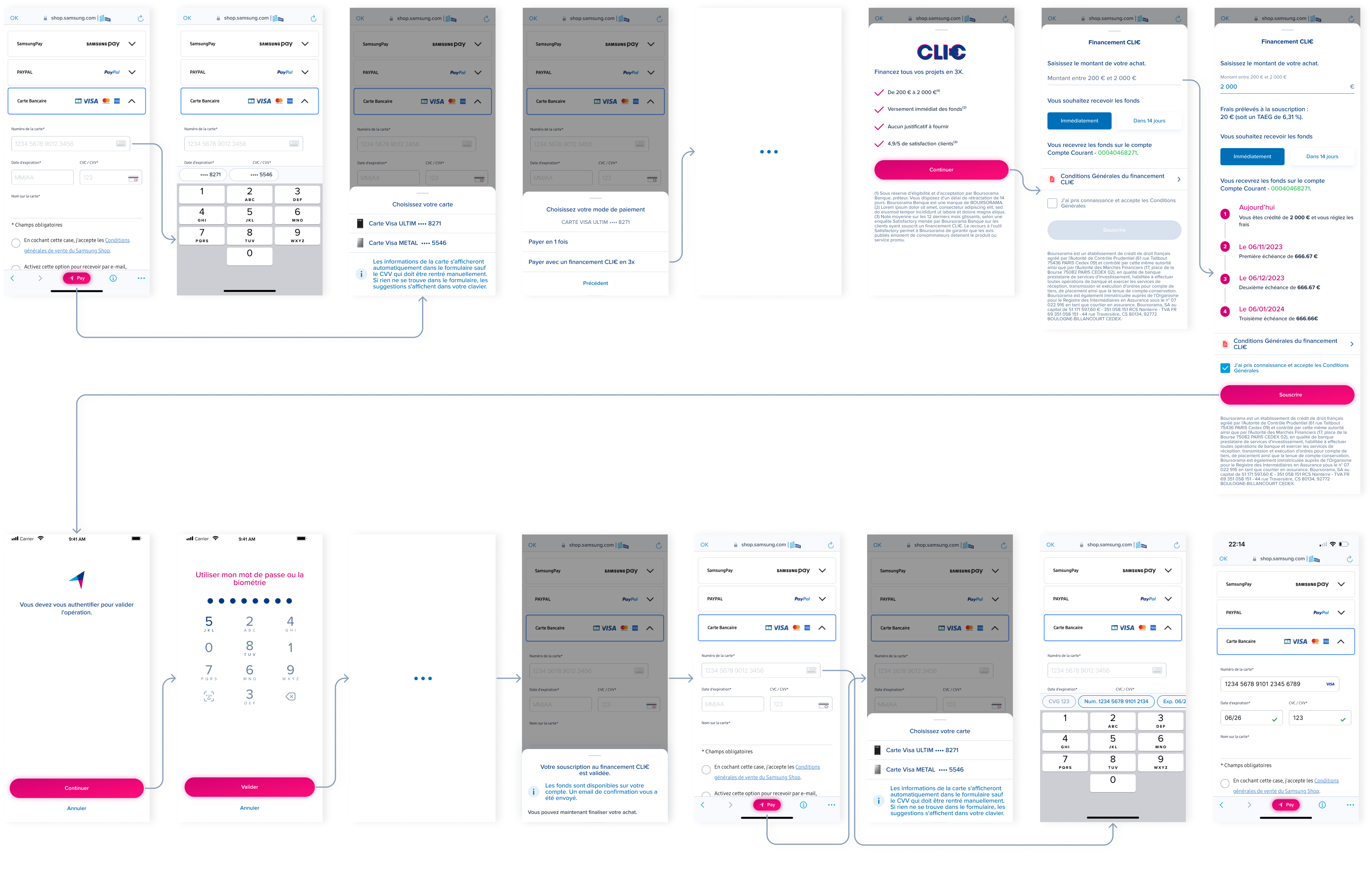
When the customer arrives for the first time on a partner site, an explanatory sheet is displayed.
By clicking on the Pay button, the customer can choose their card. In order to differentiate them, an icon is associated. The contents of the list vary depending on the number of cards (physical, virtual) of a customer.
Then, the customer selects a payment method: In one timet, or with CLI€ financing.
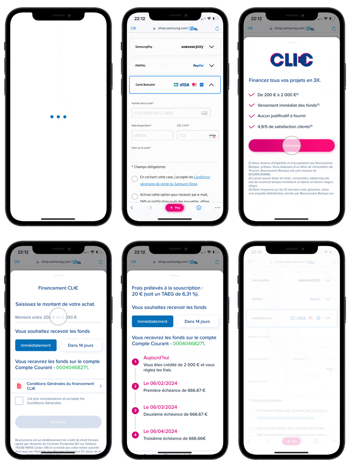
Once the payment method is selected, a loading time is necessary in order to make data calls.
In order to reassure the customer and present arguments before subscribing, a screen presenting the strong points of the product is displayed.
The customer arrives on the subscription page. He enters the amount he wants within the limit of the proposed tranche. Fees are dynamic, they are displayed according to the amount.
Then, the customer chooses the payment deadline and reads the schedule.
Finally, he validates the general conditions.
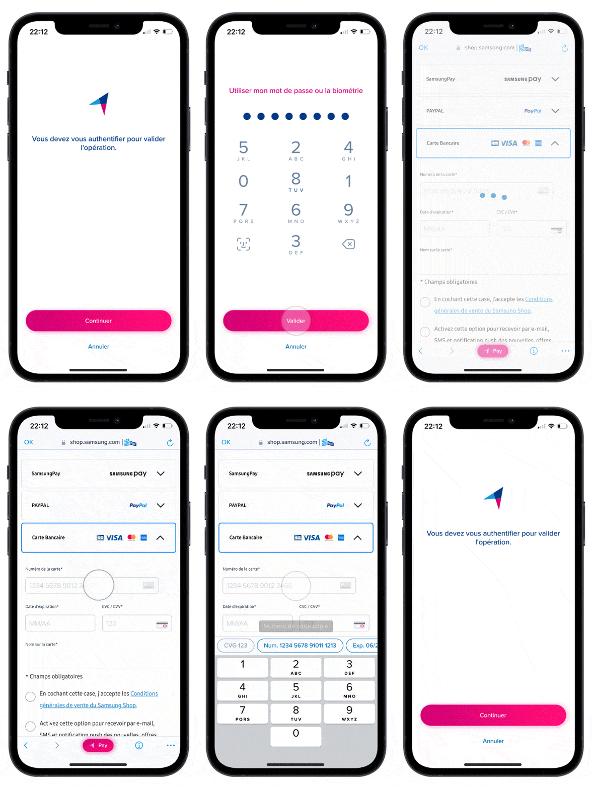
The client carries out strong authentication to validate his action.
It then returns to the partner site screen. The financing is carried out, the funds are available in his account.
He receives a validation email and a confirmation sheet is displayed.
He can finalize his purchase. Since his card is saved beforehand, he can simply paste the data into the input fields.
The Pay button remains active, when a customer has benefited from CLI€, the sheet for choosing the payment method is hidden. In fact, a CLI€ cannot be combined.

The mylombard loan is a personal loan, obtaining which is conditional on the obligatory pledge of financial assets (Securities Account, PEA or Life Insurance).
In order to optimize the operation of this credit and operational efficiency, the subscription process is evolving.
GOALS
Implementation of a 100% automated subscription process:
– Automatic detection of income and expenses BoursoBank
– Automation of the online decision to reduce the lead time of the opportunity
MY ROLE
– Creation of interfaces taking into account legal and technical constraints
– Updated existing stages with new components
– Respect of the Design System and the charter
– Respect of the delivery process to the project, compliance and technical teams
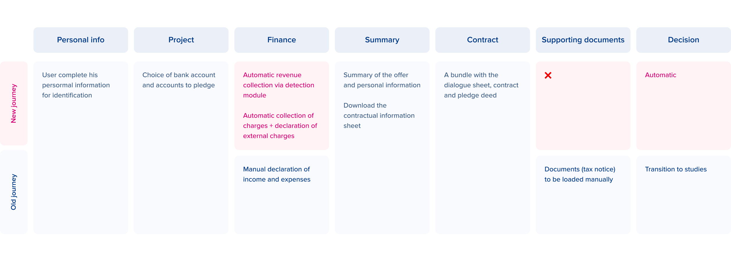
New flow
🔹 Automation of revenue recovery
Integration of the revenue detection module into the journey.
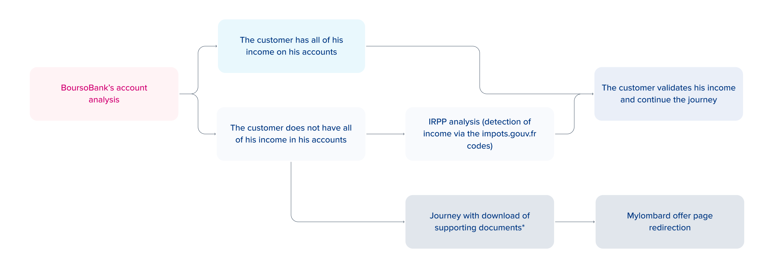
*Customers who do not wish to provide impot.gouv.fr codes can opt for a route with downloading of their supporting documents. They will be redirected to the offer page and will have 15 days to make a new request with supporting documents.
🔹 Automation of charge recovery
Real estate and loan held at BoursoBank
🔹 Automation of the decision
By integrating into the course:
– The granting rules and the calculation of the debt ratio
– All eligibility checks & the various blockages
– No more going through studies, the customer obtains an immediate and definitive answer at the end of the process
– No proof to be provided by the customer
🔹 Reduction of opportunity deadline to 15 days
Comparison
First steps
The customer is directed through the subscription process after having carried out a simulation from the product offer page.
The steps for personal information and the project are the same for the 4 different cases.
In order to have an overall view, several steps are displayed on the same screen. In production, the steps are displayed as a field is completed or a button is selected.
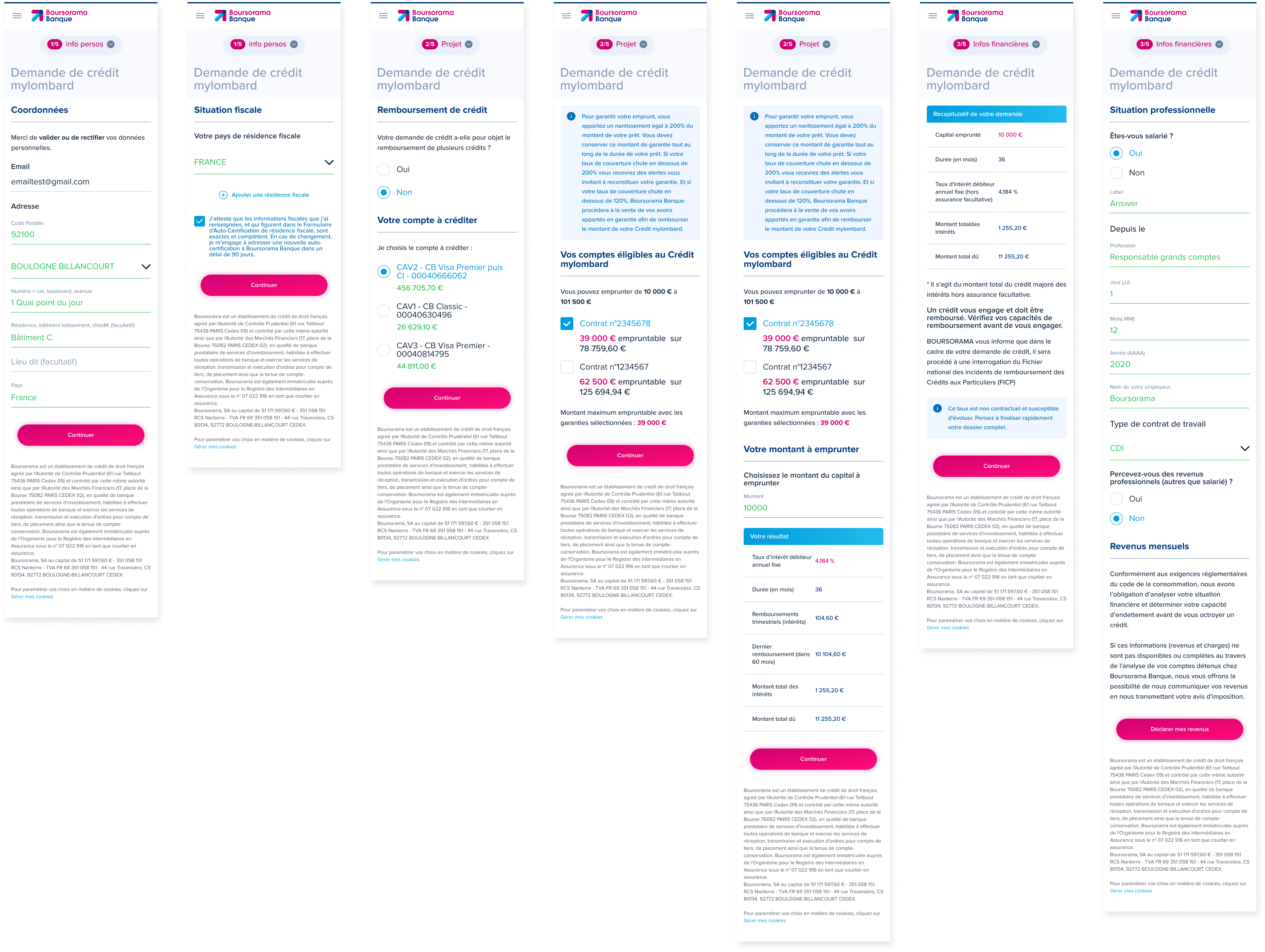
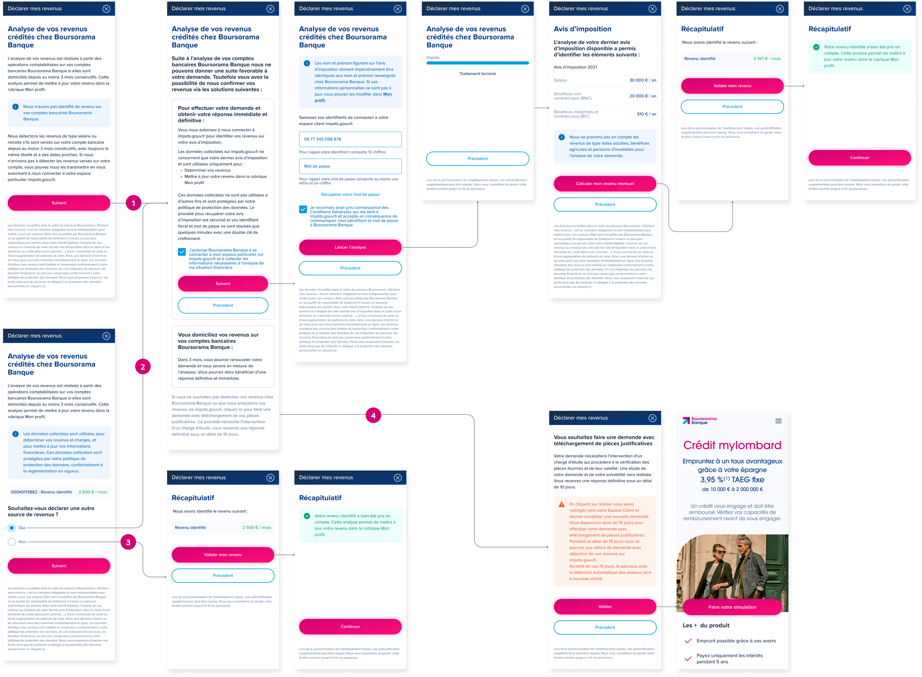
Income detection: 4 Cases
1. Boursorama did not identify any income. The customer opts for automatic detection via their psychologies.gouv.fr identifiers.
2. Boursorama identifies revenues but they are not up to date. The client goes through the detection module to update them.
3. Boursorama identifies income and is up to date.
4. The customer opts for a route with a download of supporting documents. He is directed to the product page to re-apply within 15 days. The rate is blocked during this period.
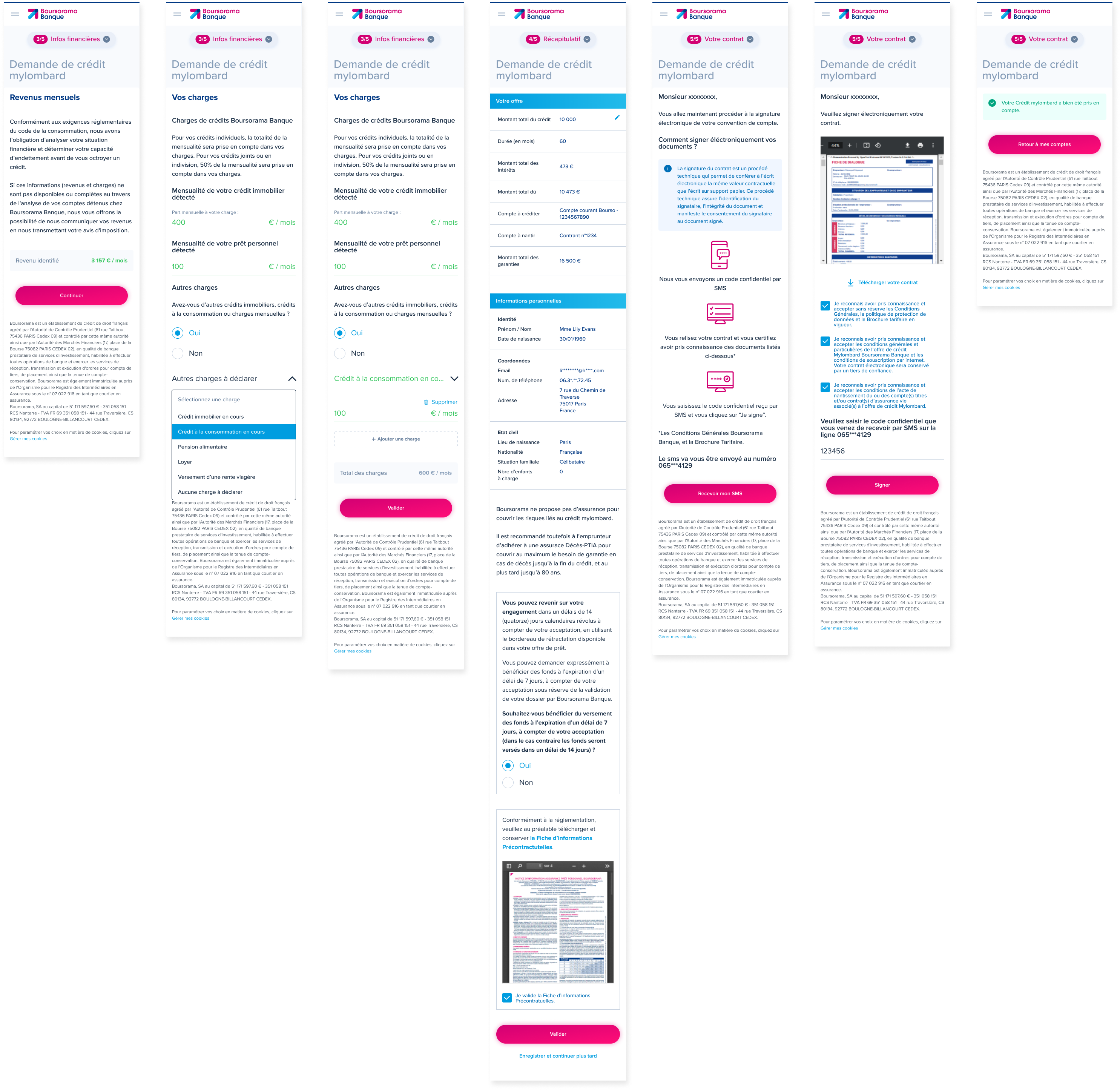
Charges & end of the flow
Once the income has been identified and validated, the customer exits the modal and continues his journey. Its BoursoBank credit charges are detected automatically. The amounts of real estate credits or personal loans are identified and pre-filled in the form. The customer can also manually add other charges outside BoursoBank via the select and the dedicated field.
The customer validates his charges, checks his offer and his personal information one last time and proceeds with the electronic signature.
The contract is signed, he can return to the home page. The customer will be able to access their owner page in their space.
Design System
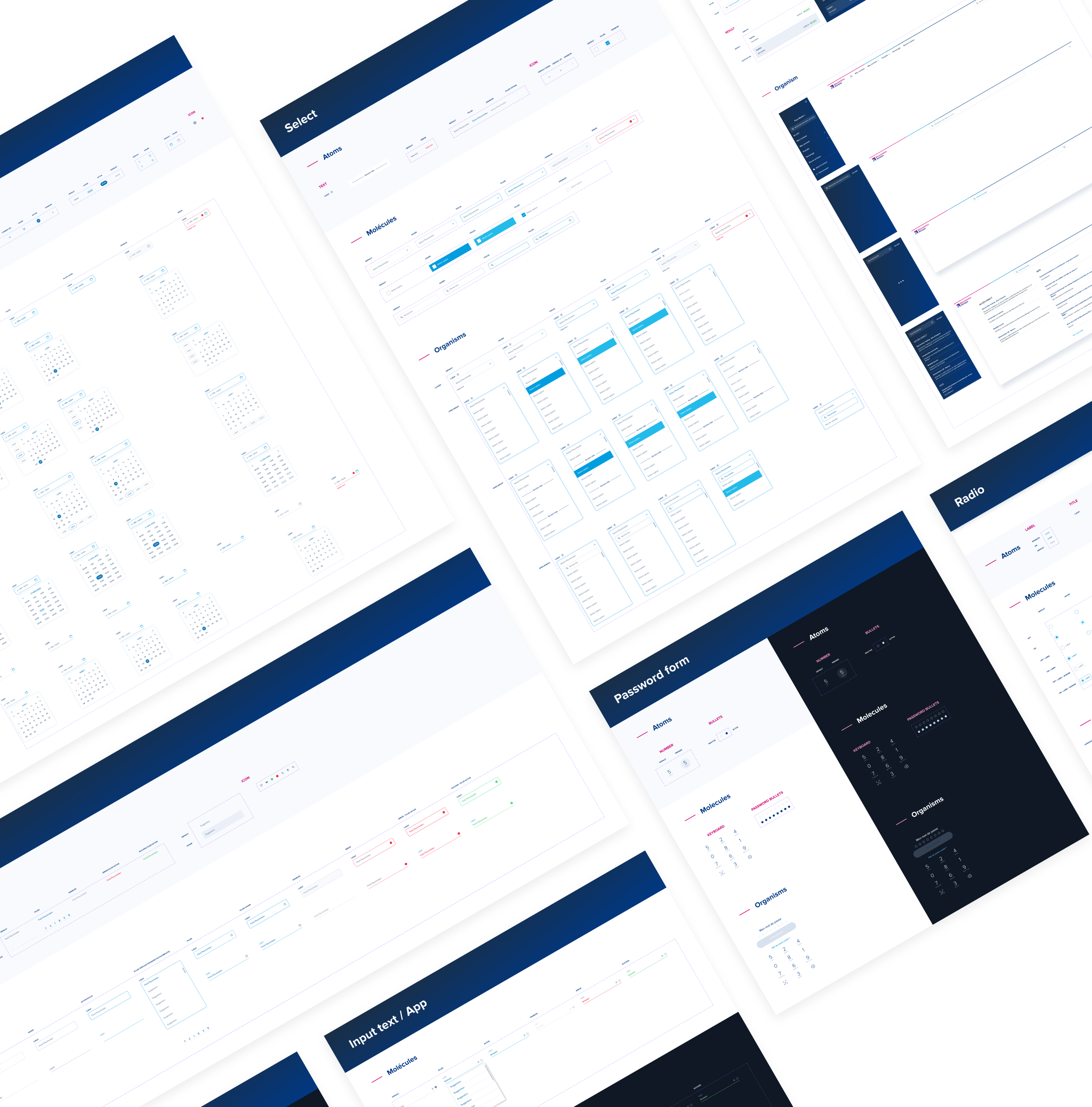
The designers of each division participate in the maintenance and development of the Design System. It’s a team effort between designers and developers. Depending on new business needs, the components are destined to evolve. They are also updated according to Figma updates in order to use best practices and optimize their specifications.
The Design System encompasses several environments:
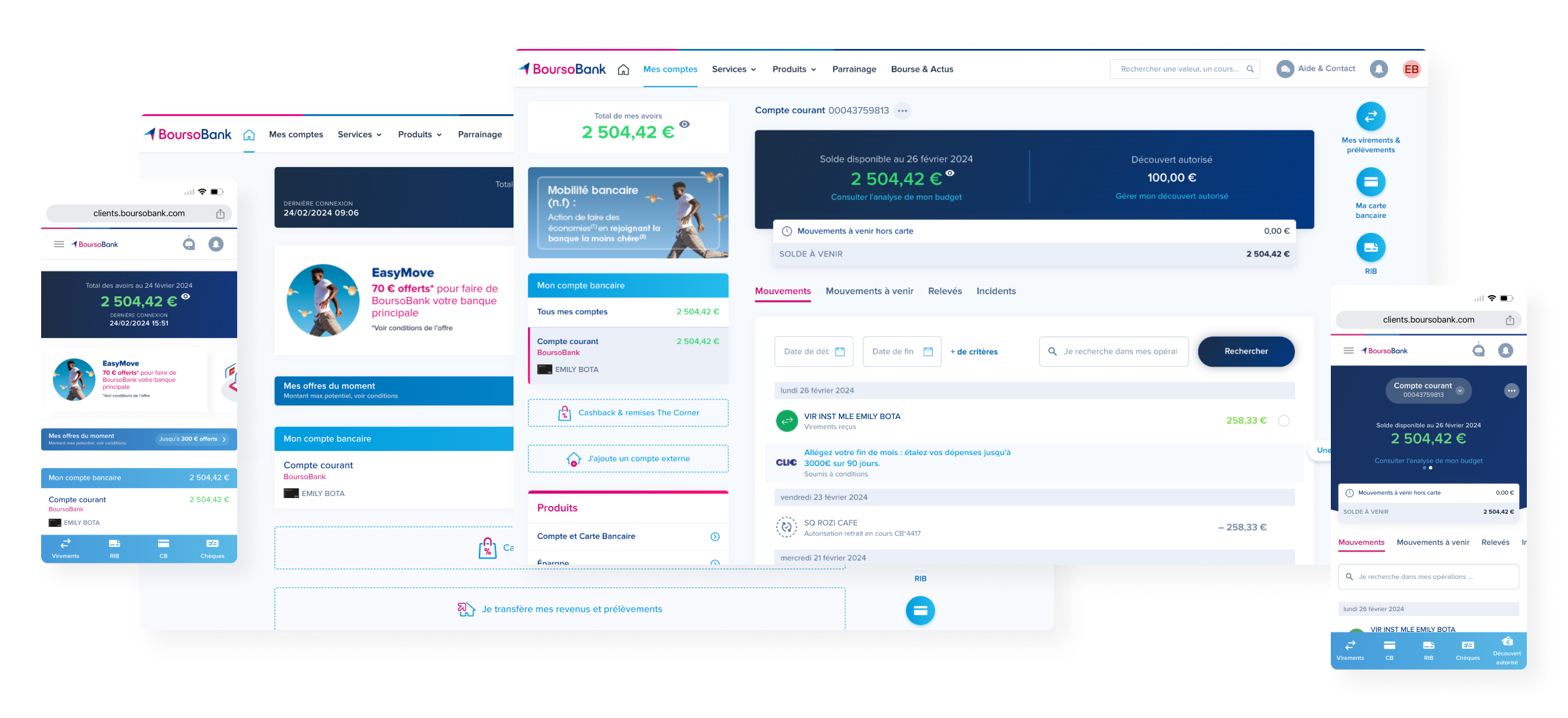
Client area
BoursoBank customers area from a desktop/mobile navigation
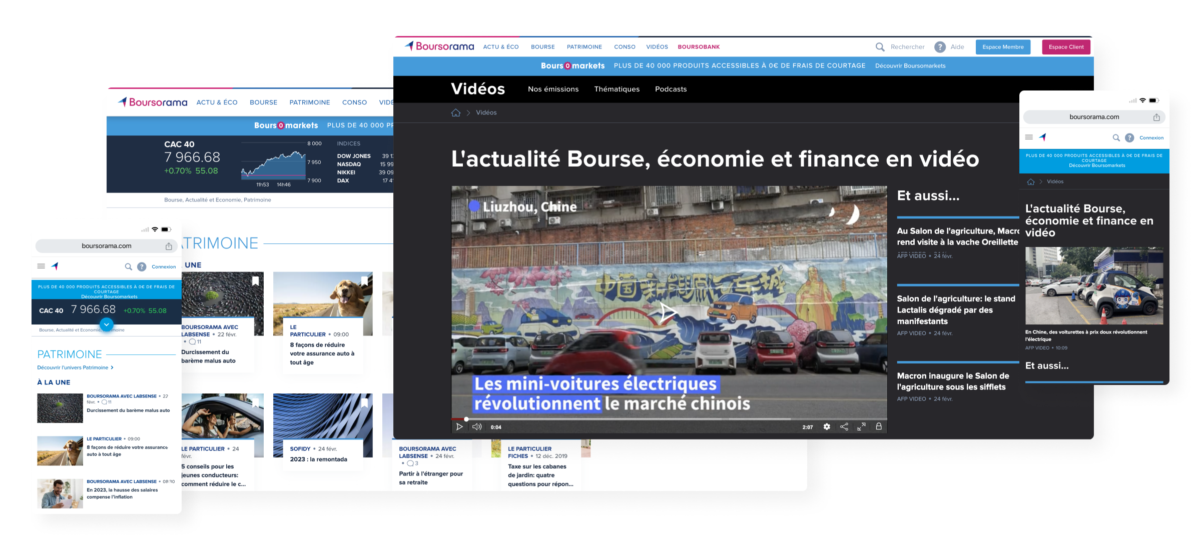
Portal
Showcase website for economic, banking, stock market news…
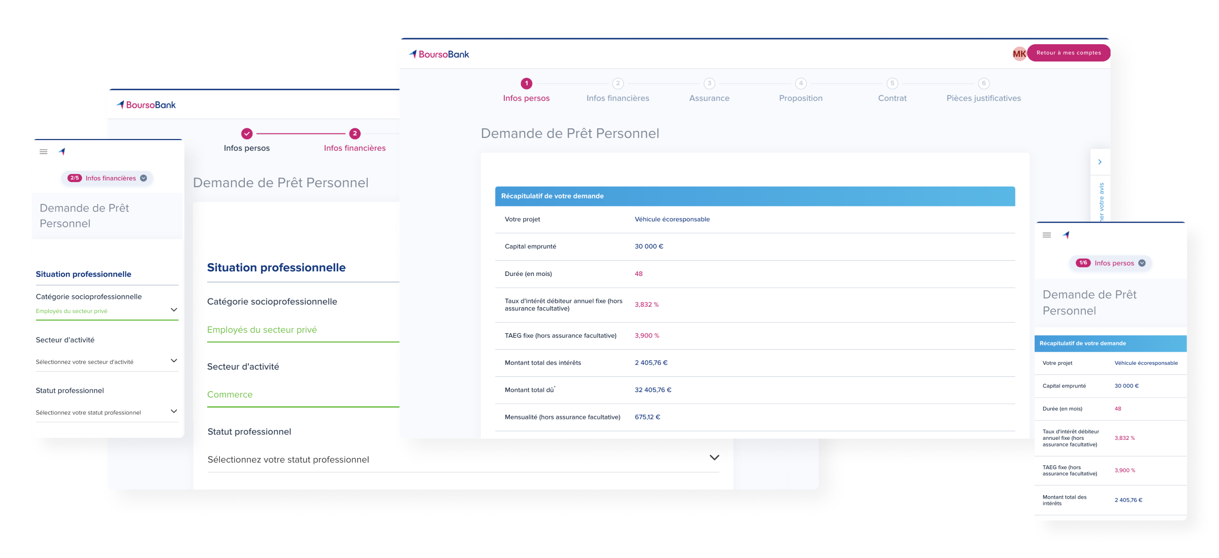
Subscription process
Environment dedicated to subscription accessible from the customer area
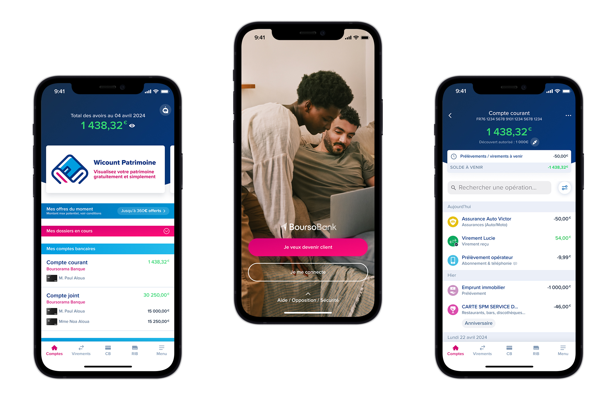
Application
BoursoBank customers area from the app
Showcase
Unconnected space where offers, services and products are presented
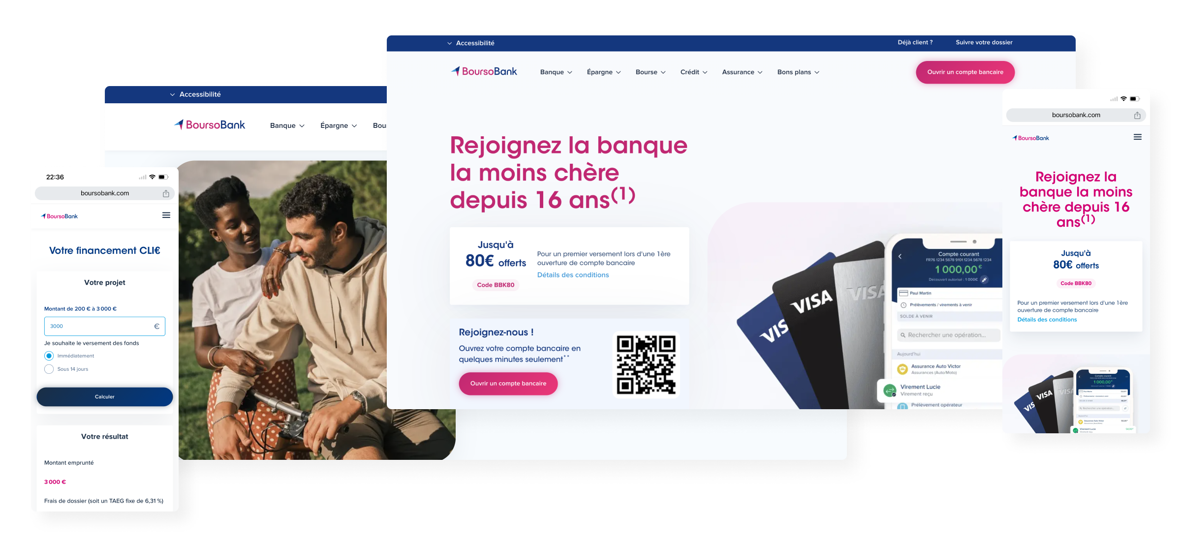
Workflow
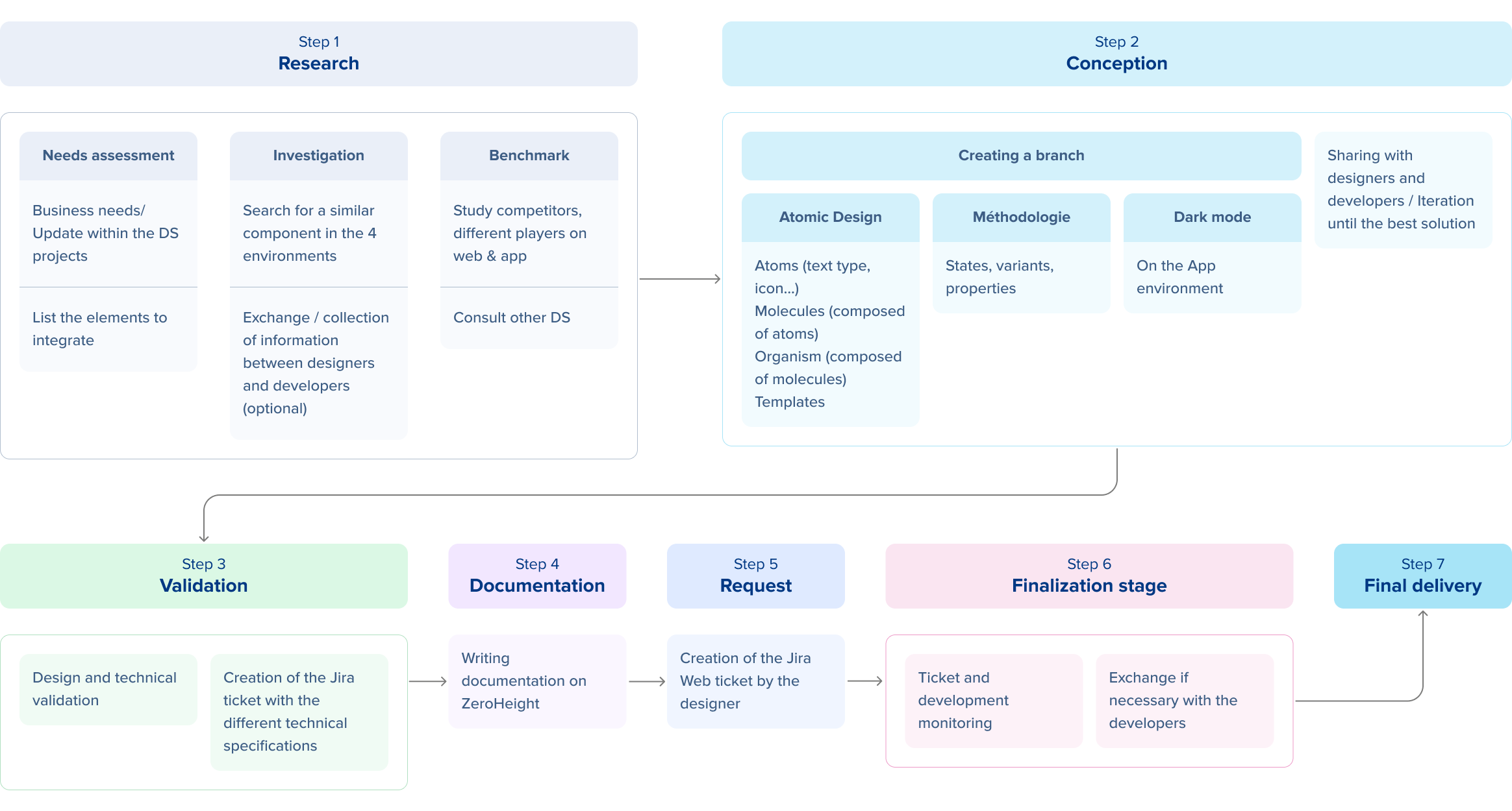
Method of working
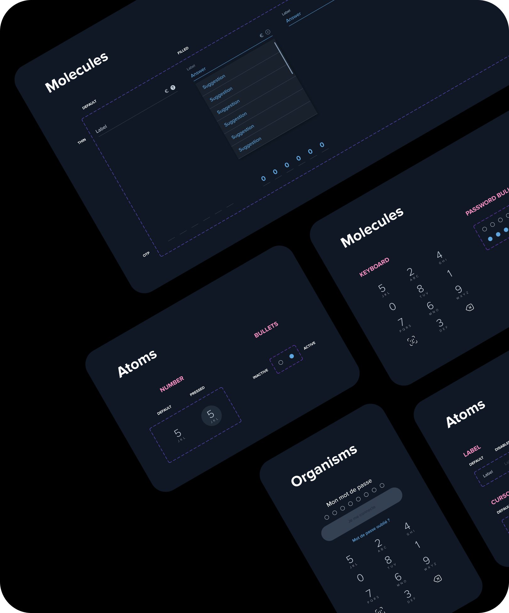
Each component is designed in Atomic Design. The idea is to start from the smallest element (atom) to design larger ones (page, screen, etc.).
A component is organized into:
Atom: It represents the graphic basis of the interface, it is the only element which has no functional purpose and cannot be divided.
Molecule: It is composed of a set of atoms forming the first elements of the interface.
Organism: It designates the complex interface elements resulting from the grouping of molecules and possibly atoms.
Template (optional): These are page or screen templates. They show the general structure of the content, its skeleton, the final page…
Update
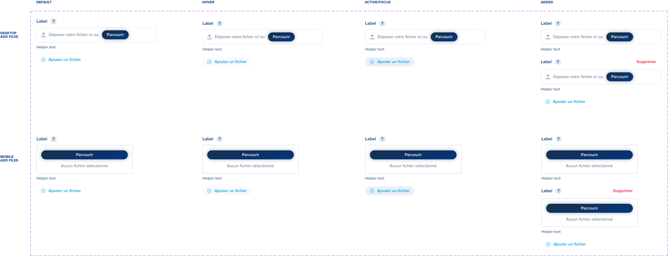
For example, the upload field is one of the components redesigned to better meet customer needs.
BEFORE
– Different components used on websites
– Uploading a file via desktop
– No possibility to delete a loaded file
– Once a file is loaded, the file name replaces the text helper
– No possibility to view the loaded file
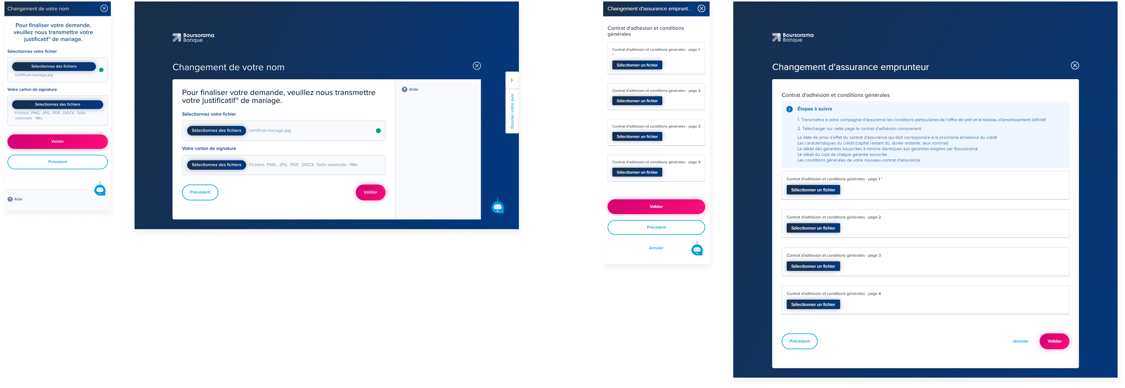
AFTER
– Single component used throughout the site
– Loading a file via drag & drop or desktop
– Added a loader, tooltip and helper text
– Ability to view an uploaded file and delete it
– Possibility of adding and deleting an additional upload field (technical constraints do not allow adding several files in a field)
Molecule
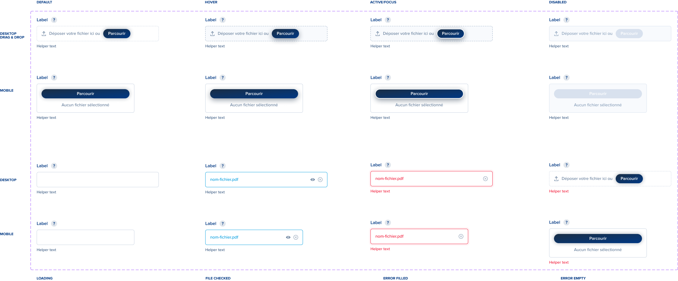
Organism
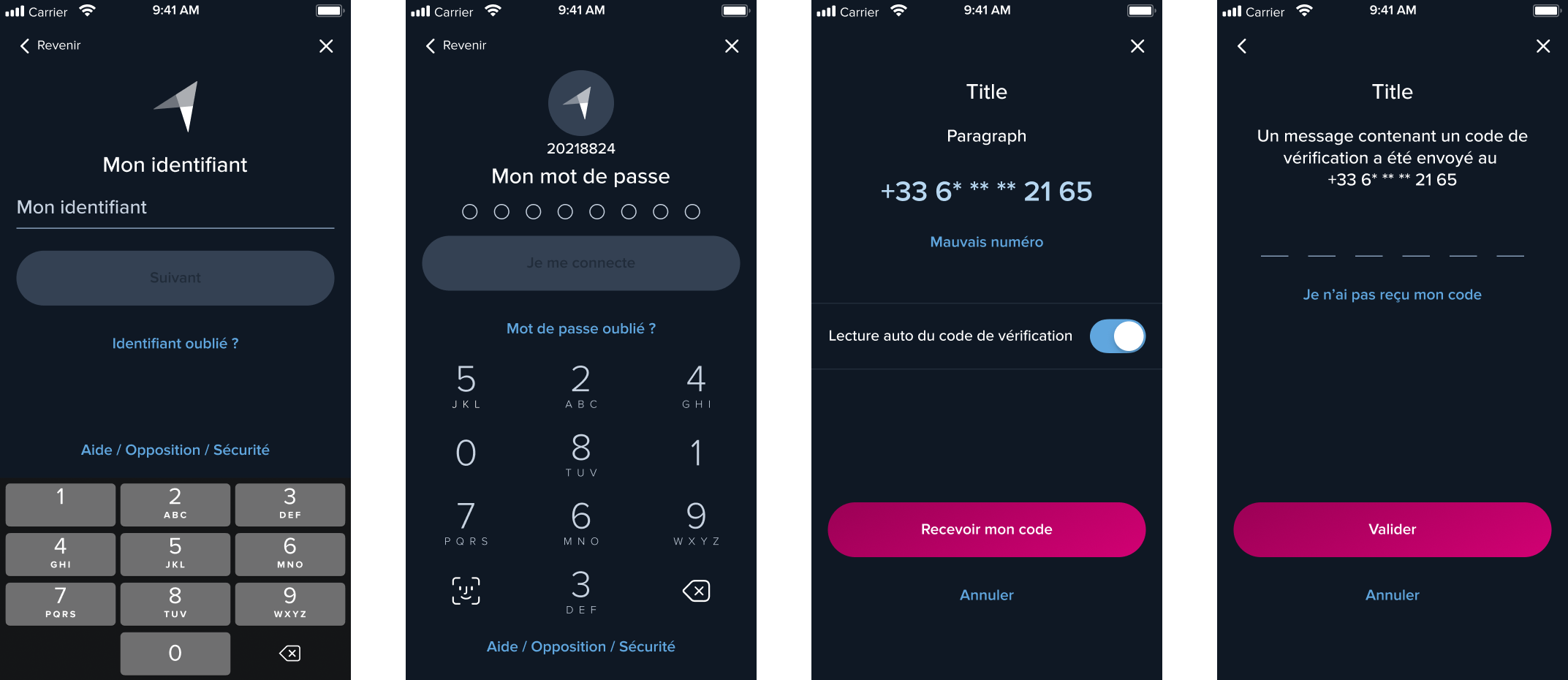
Dark Mode
The Dark Mode project is currently being developed to meet strong customer demand. The objective is to develop an improved user experience and contribute to energy saving, taking into account accessibility.
Documentation
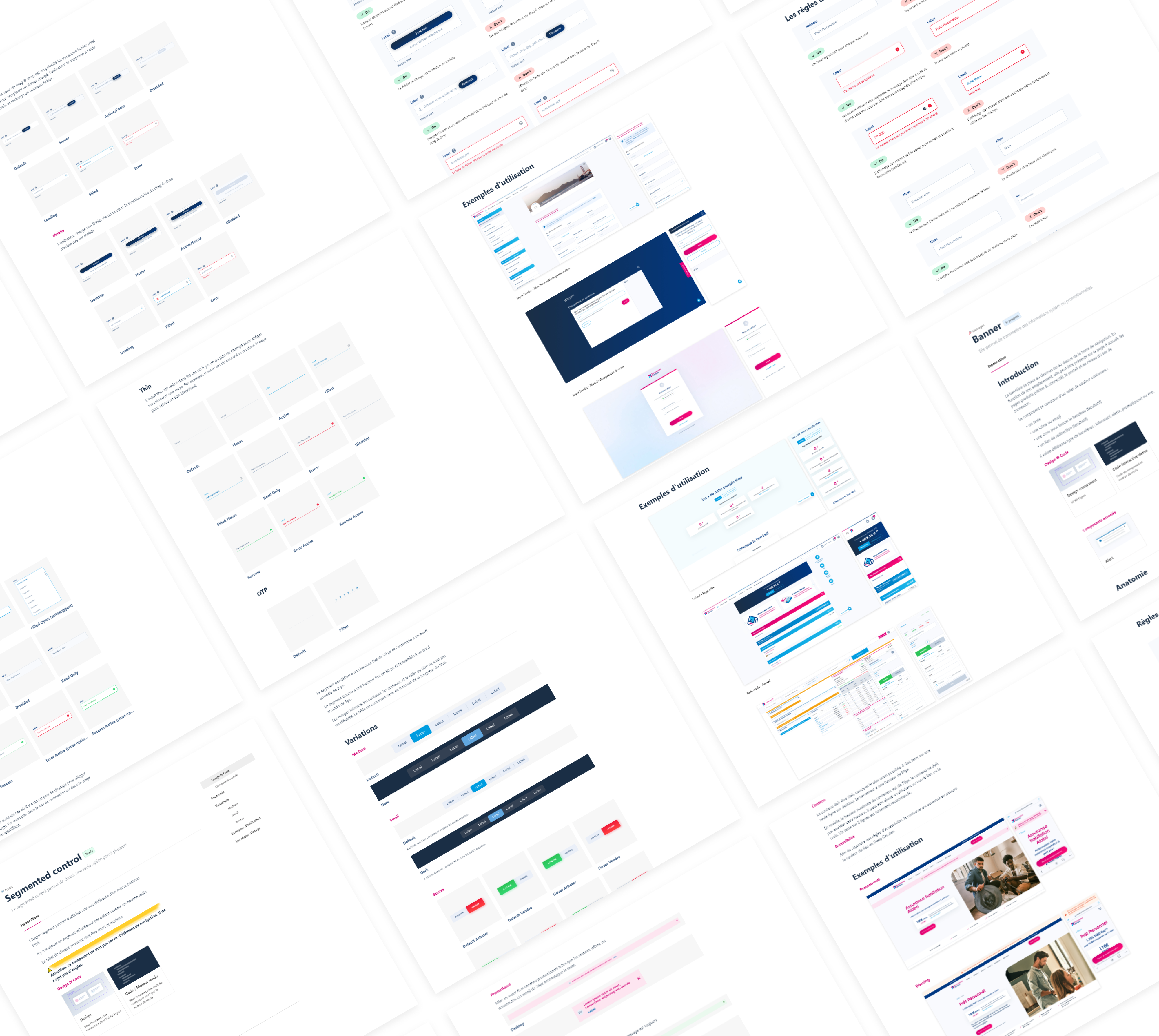
Each component has its documentation. It consists of an introduction, anatomy, variations, examples and rules of use. It is written on Zeroheight, each component and its variants are linked to the Figma source file. This shared online document allows designers, developers and marketing teams to base themselves on common rules.
