DINUM
The Interministerial Digital Directorate is in charge of the digital transformation of the French State for the benefit of citizens and agents alike, in all its aspects: modernization of the State information system, quality of digital public services, creation innovative services for citizens…
It supports ministries in their digital transformation, advises the government and develops shared services and resources such as the State interministerial network, FranceConnect, data.gouv.fr or api.gouv.fr.

CONTEXT
In order to meet the needs for collaborative work and to be part of the digital ecosystem offered to all ministries, the MAIA directory, which has existed for more than 15 years, requires a complete overhaul as a new product. DINUM is supporting the development of this new MAIA for the benefit of all State agents.
MY ROLE
My mission for this project consists of carrying out an audit of the existing and proposing UI/UX recommendations on the platform. I wrote a questionnaire and interviewed users to get their opinions. Based on user feedback and best practices, I worked on redesigning the platform’s interfaces.
MAIA
The MAIA directory service is an online government directory accessible on the interministerial intranet network open to state services. It results from the aggregation of the directories of all ministries. This tool facilitates interministerial work and contributes to the decompartmentalization of administrations.
The platform allows you to:
👉 Search for agents, services or functional mailboxes in a central directory supplied by various ministerial supply points
👉 Create mailing lists, save them and share them within the application
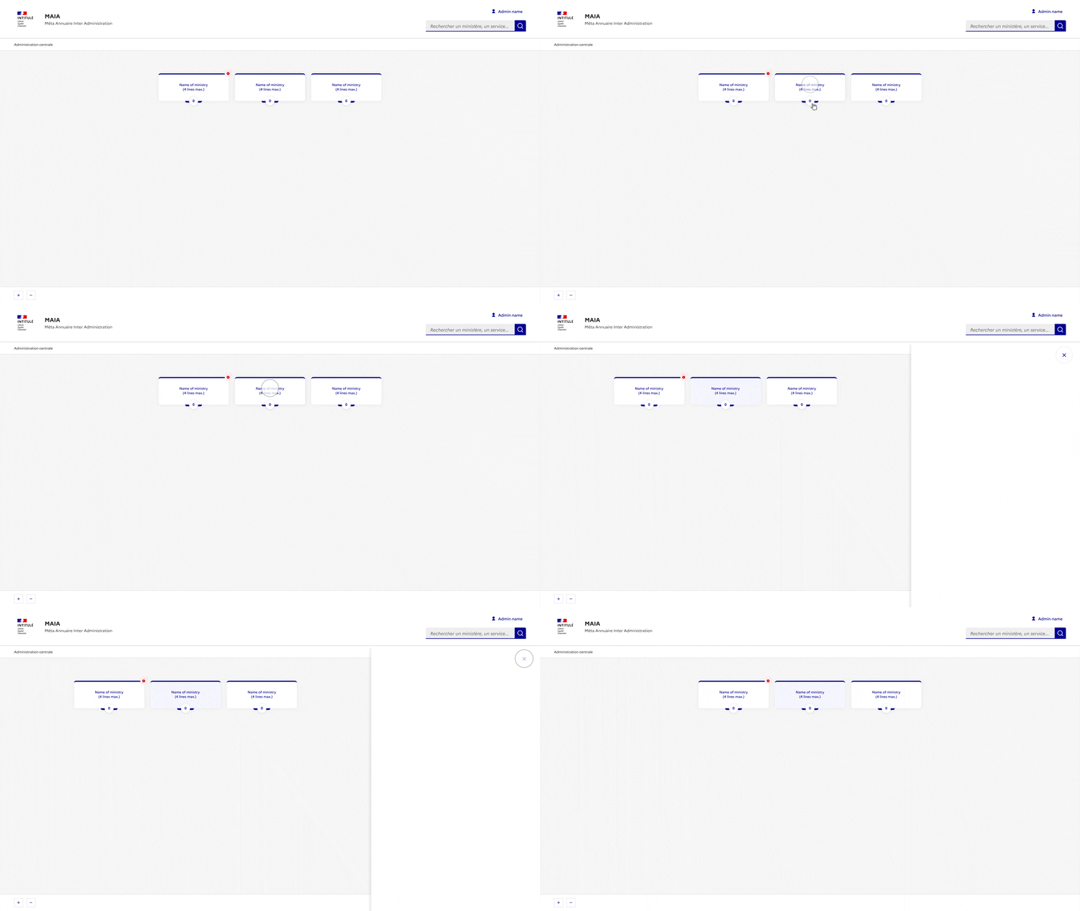
👉 Get a view of an interactive organizational chart
UI Kit
Components and icons of the French State Design System are used in the interfaces to maintain the identity of the republic.

Fundamentals
Colors, grids, typography and icons, the basics for building your site or application.

Components
Documented components and models available in Sketch, Figma and HTML/CSS.

Modeles
Functional blocks and page templates based on DSFR components.
Users feedbacks
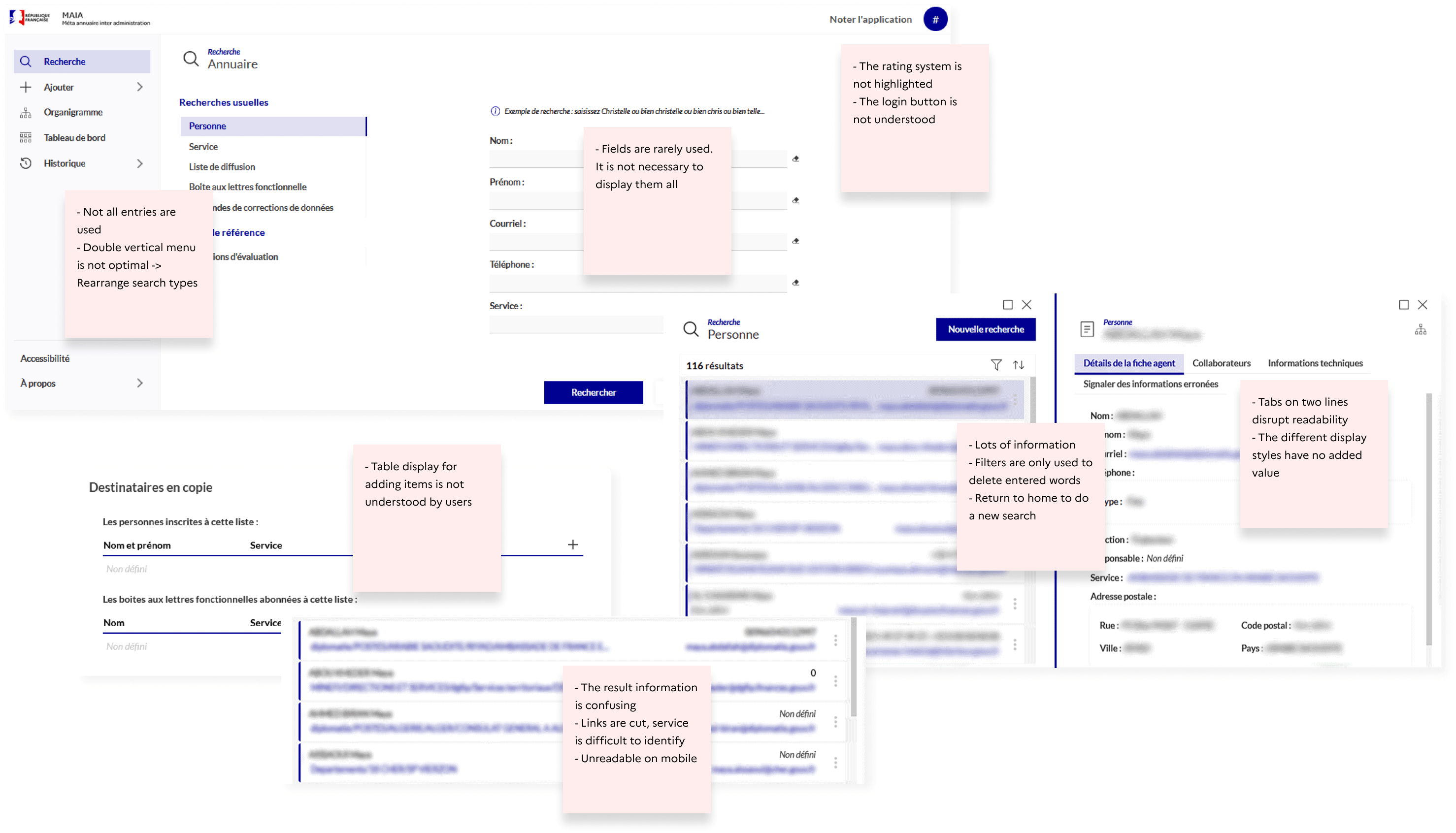
Following the interviews, I was able to collect user experiences. To make it easier to think about the interfaces to create, I have classified the reviews by functionalities and entry points.
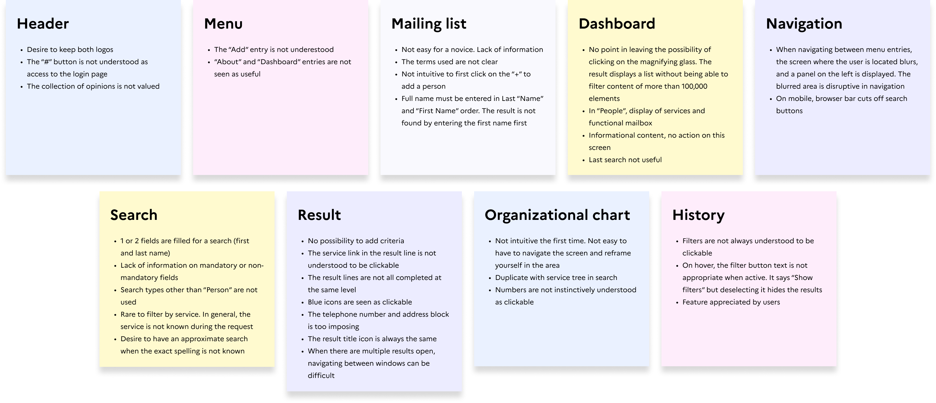
Existing screens
Overview of the problems encountered. The platform is mainly used on desktop.
For confidentiality reasons, information concerning state agents is blurred.
Solutions / Redesign of interfaces

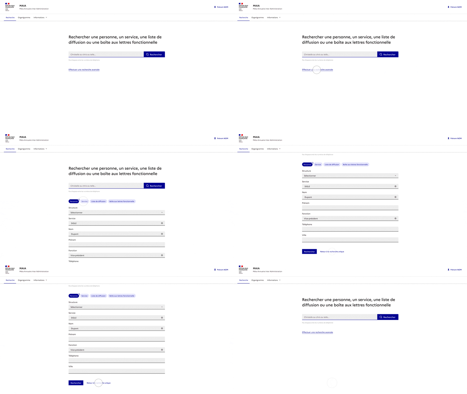
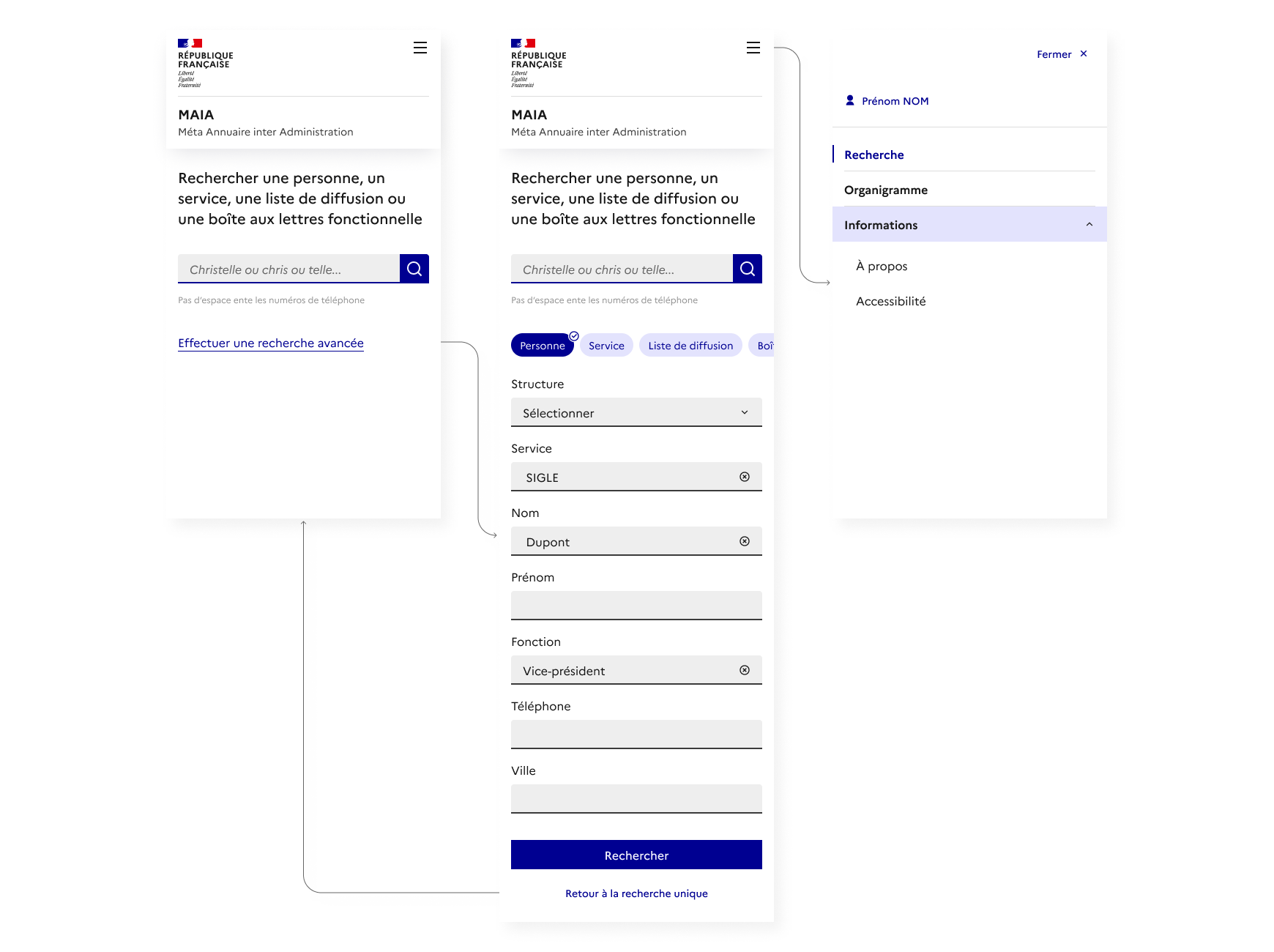
Home / Search
→ Horizontal navigation bar to be consistent with state sites. Reduce the entries (5 instead of 7)
→ Minimalist design to focus on research
→ Show a single search bar
→ Preserve information to guide research
→ Ability to perform an advanced search
User stories
👉 As a user, I want to perform a search to find my result.
• Simplify the page as much as possible to facilitate action.
• Show a unique search bar. The field is wide enough to comfortably enter your search.
👉 As a user, I want to be guided in my input in order to simplify my query.
• Highlight possible types of search in the form of a title/hook.
• Show a sample query in the input field.
• Indicate good entry practices (telephone number).
👉 As a user, I want to refine my search to limit my results.
• Add a link below the search bar to display filters.
• Select a type of search (person, service…).
• Complete the input fields. The 6 fields displayed are the same for all search types.
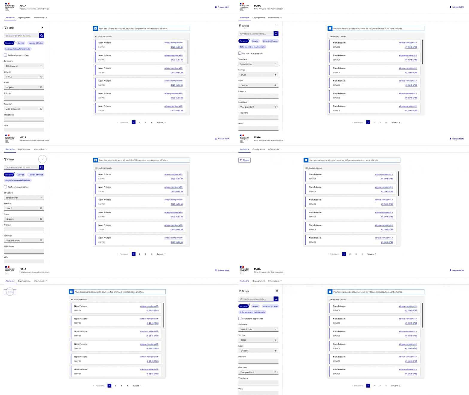
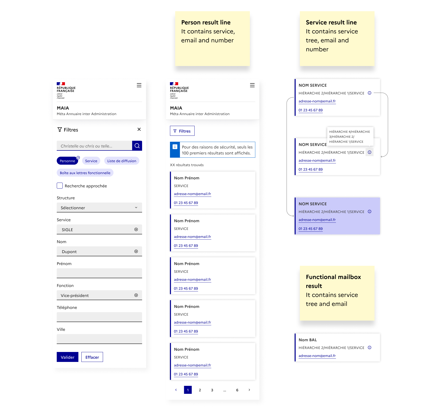
Result of a search
→ Show filters vertically by default. Possibility of closing them
→ Preserve advanced search items
→ Reduce and prioritize information in the result line
User stories
👉 As a user, I want to visualize the quantity of results in order to estimate the consultation time.
Show number of results and pagination
👉 As a user, I want to quickly identify the content of a line in order to have an overall view of my results.
Show only useful information
👉 As a user, I want to clear all my filters in order to add new criteria.
The “Clear” button allows you to delete all the chosen values
👉 As a user, I want to carry out a new search in order to continue my investigations.
Show search bar in filters
👉 As a user, I want to easily filter my result in order to modify my targeting.
• Edit or fill in input fields
• Select or deselect tags
• Activate approximate search in order to target a broader result
👉 As a user, I want to easily close the filters in order to only have a view of my results.
The cross allows you to retract the panel.
👉 As a user, I want to quickly contact a person/department in order to communicate information.
Make the number and email clickable
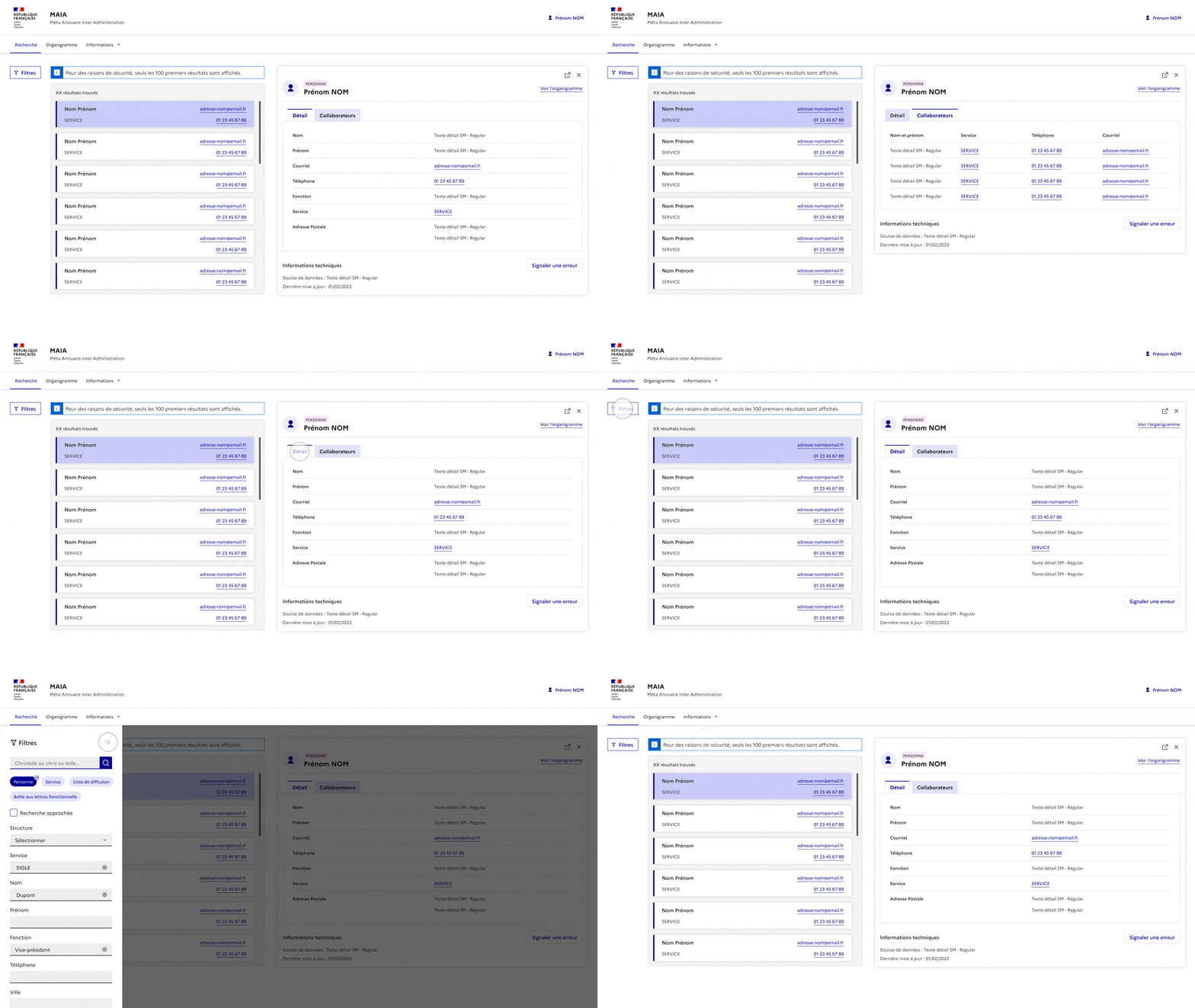
Detail sheet
→ Keep filters and the search bar / The side panel displays on top of the content, on an opacity background
→ Associate an icon with the title in the result sheet
→ Remove the “Report” action from the tabs / Display it in a modal
→ Display one sheet per window / Each new sheet replaces the old one
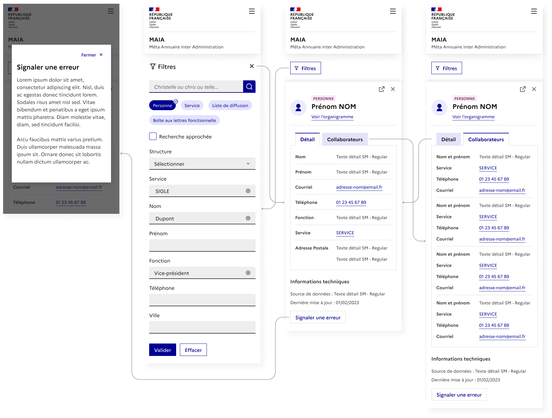
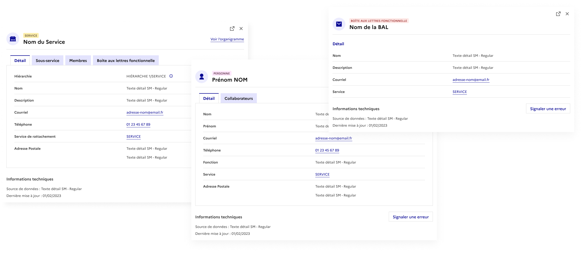
Each type of sheet is associated with an icon and a colored tag to quickly identify them.
The tabs and content vary depending on a service, person or functional mailbox sheet.
User stories
👉 As a user, I want to report an error to update a file.
Display in a modal information on the service to contact.
👉 As a user, I want to open a file in a new tab in order to keep my result.
The “external link” icon allows you to open a file.
👉 As a user, I want to close a file in order to return to displaying the results.
The cross allows the user to close the file.
👉 As a user, I want to open a file to access the details.
Accentuate container states (default, hover, clicked).
👉 As a user, I want to modify my filters in order to refine my results.
The “Filters” button opens the pane. It is displayed on desktop over an opacity overlay on the content. The filters are not confused with the result. Once the criteria have been validated, the result screen alone is displayed.
👉 As a user, I want to quickly navigate between the files in order to compare them.
Keep the screen in 2 sections: result and form. Each selection of a result opens a file which replaces the previous one.
👉 As a user, I want to navigate between tabs to consult the data that interests me.
Show tabs on a single line and keep the same structure for all data.
Organizational chart

The platform offers the possibility to navigate in the organization chart. The user can be redirected to a service or person file. Conversely, he can access the organization chart from a file.
Problematic
The data comes from different sources. Some come from the Public Service Directory (P.S.D.), and others come from supply points.
Inconsistencies identified on the platform:
• Different names of structures (name vs acronym)
• The complete tree is not clearly displayed for all cases
• Sub-service is not displayed based on entry point
The user ends up with incomplete files and information depending on their search point.

Reflection / Solution
👤 User : Department head
🎯 Objective : Update information with that of the P.S.D. when it is missing on MAIA
💭 Challenge : How to link P.S.D. and supply points information ?
Graph behaviour
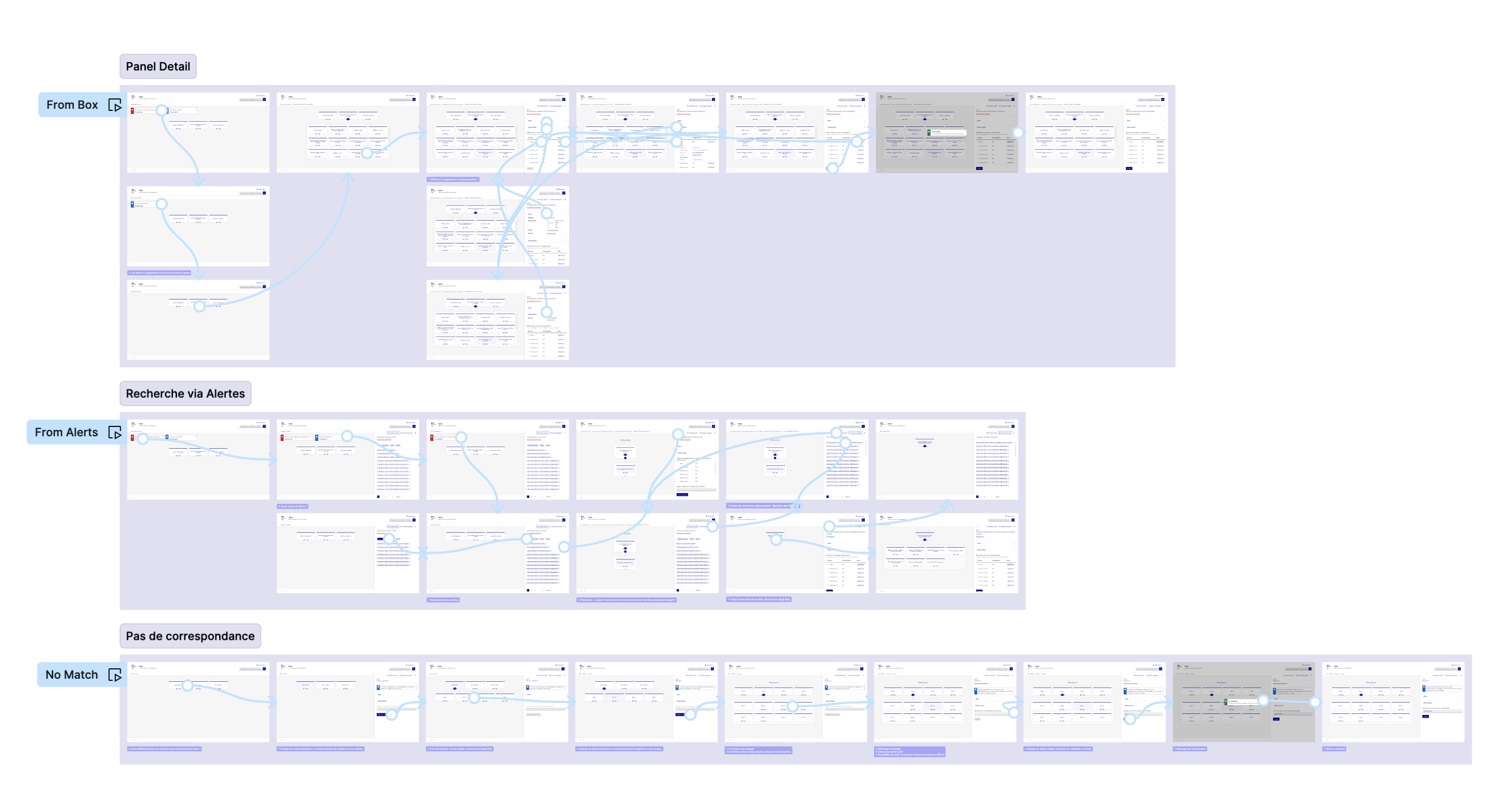
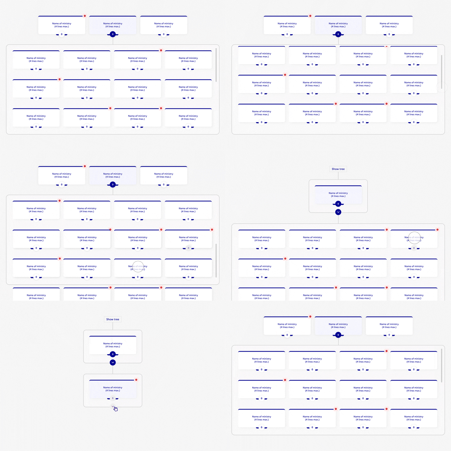
The graph displays the roots by default. The user can expand the sublevels and navigate the organization chart. The cross icon indicates that the service is not linked to ASP sources. The user must take an action to restore the incident.
When a box is clicked, a panel slide in and displays information about the service.
Focus on the graph
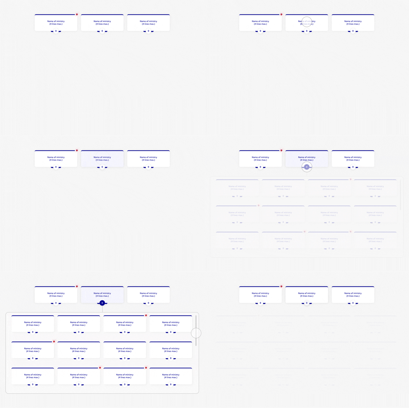
There are 2 click zones in the box. By clicking on the box, the panel opens. By clicking on the number (which represents the number of sublevels), the sublevel unfolds.
The user can access sublevels if there isn’t a cross icon.
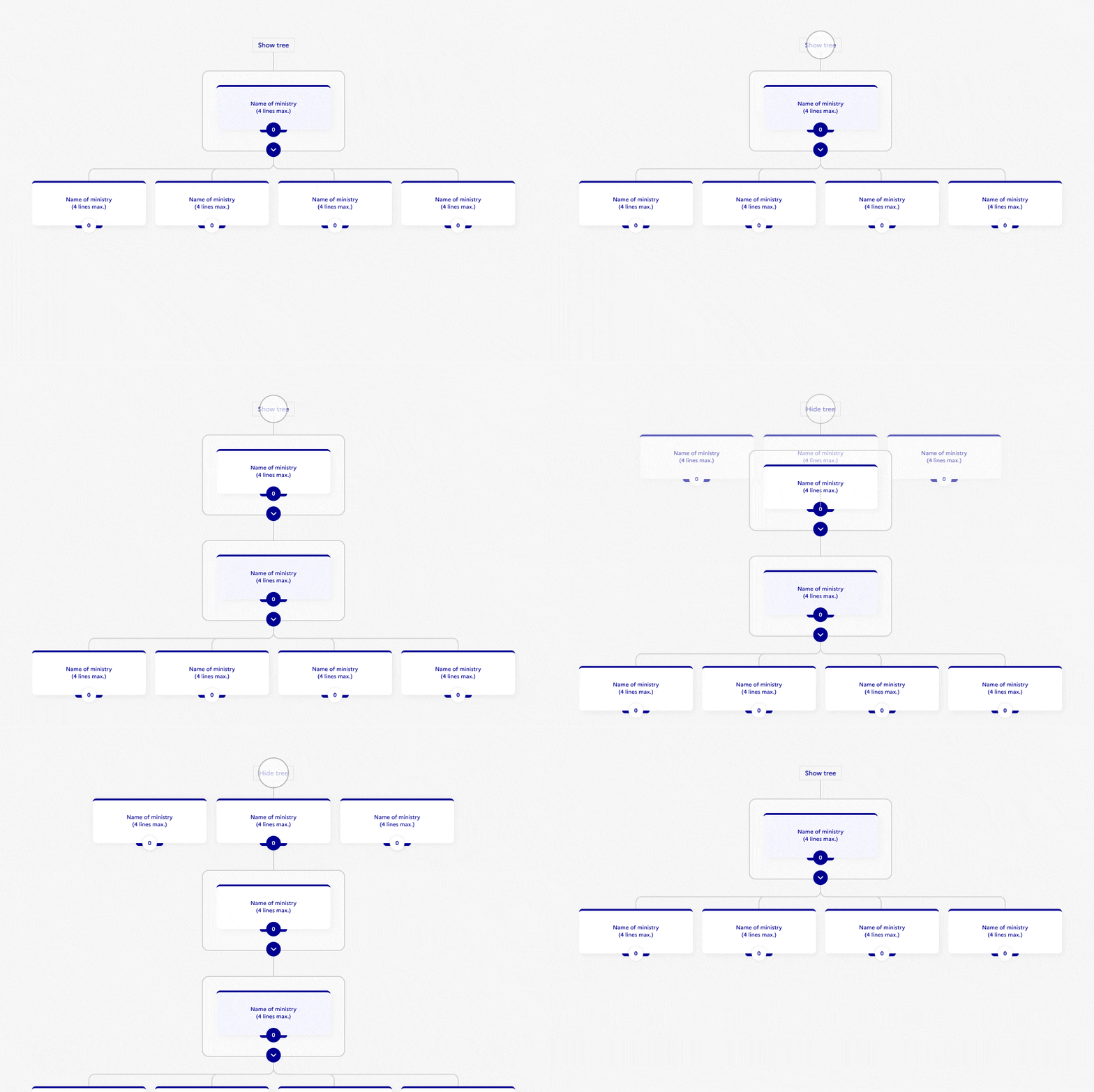
User can view previous levels via the button « Show tree ». It can also be folded back and returned to its original display.
Sublevels can be displayed without the outline when they fit on 1 line.
Isolated case
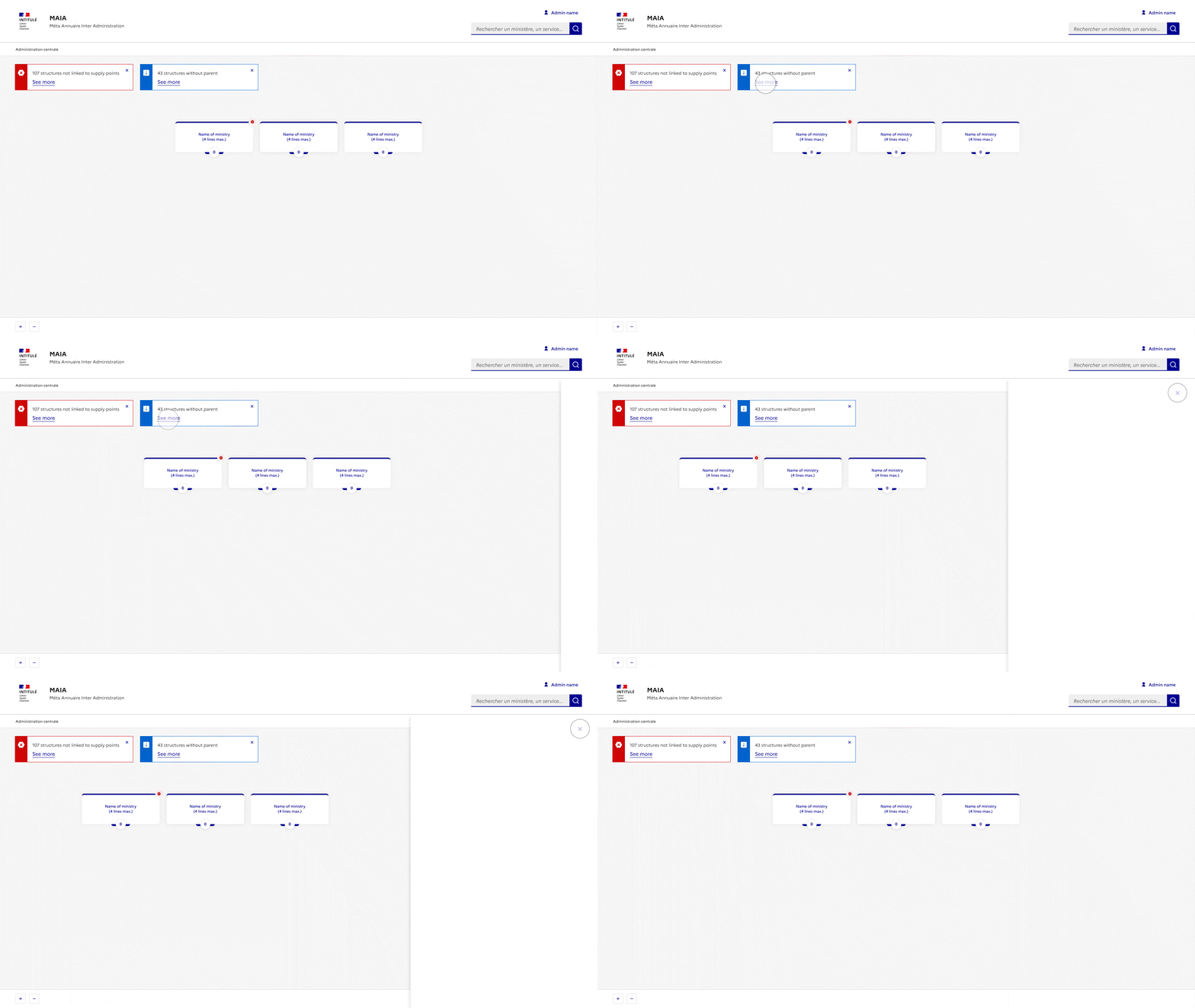
Services that do not have a parent service.
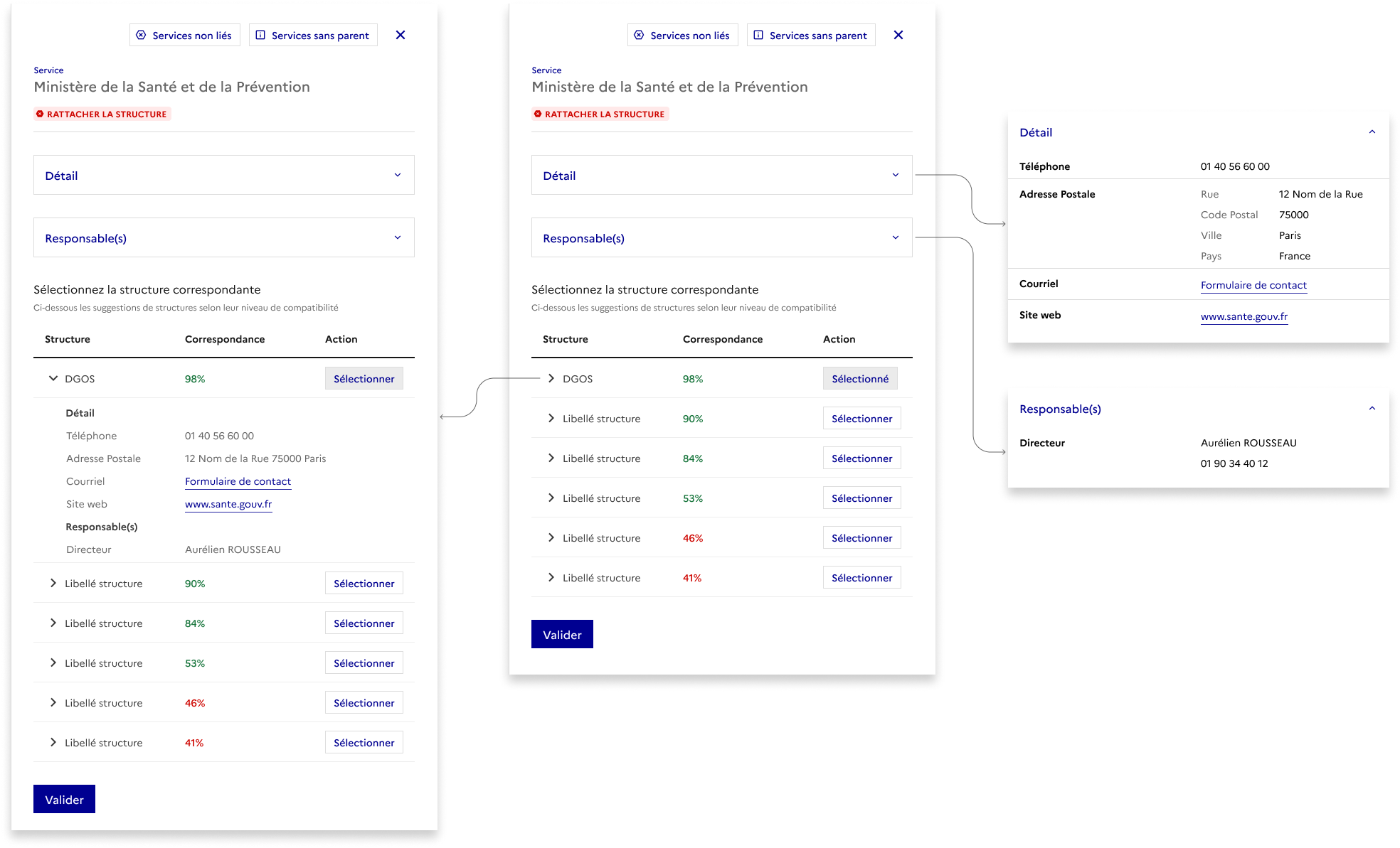
This type of structure cannot be found in the organization chart. Using an alert that opens the panel, the user can have access to these services.
Also, with the help of an additional alert, unlinked services are identified more quickly.
Navigation takes place in the panel and not in the organization chart
Focus on the panel
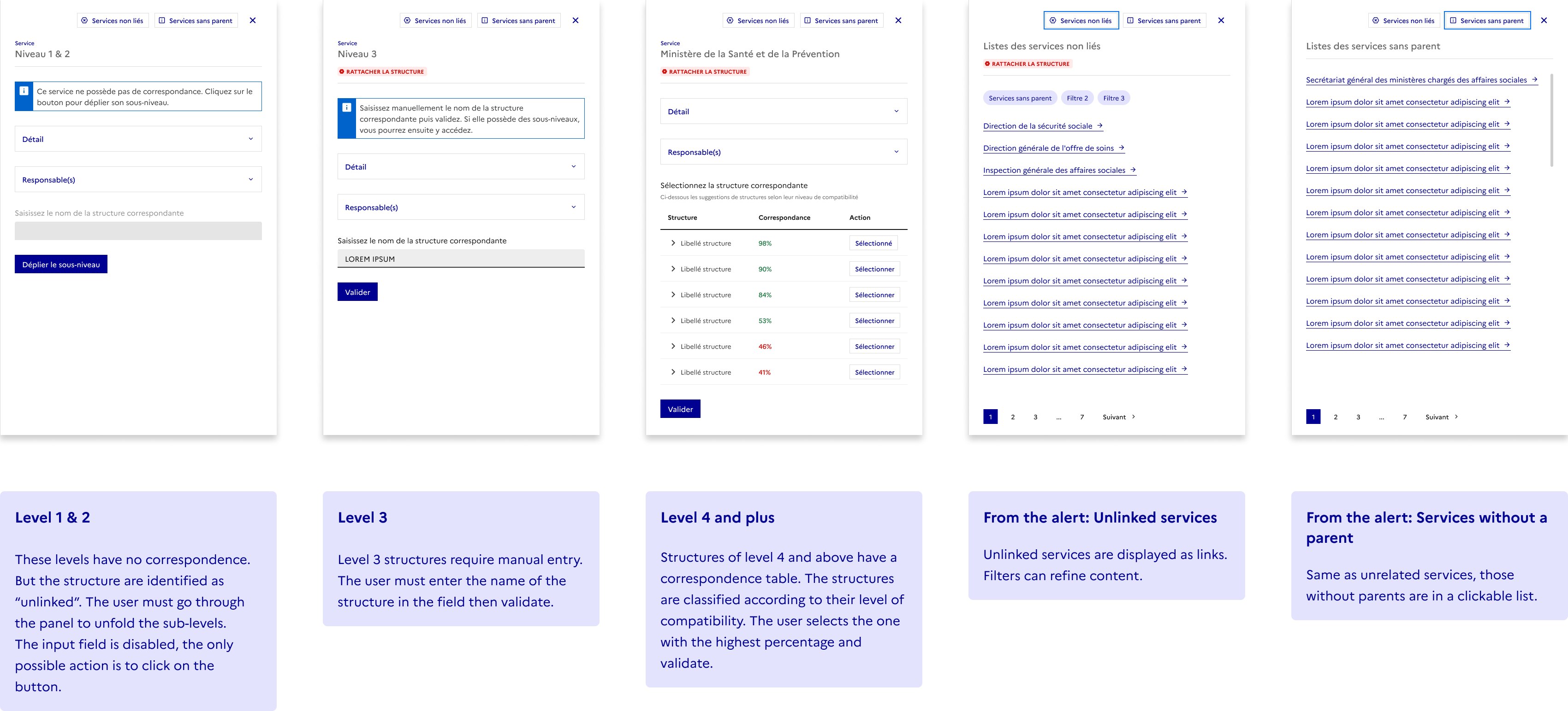
Technical constraints force me to keep a similar structure and content for the types of panels that open from a box.
The user can see the details by unfolding the accordion and chevrons of the table.
Small overview
