DINUM
The Interministerial Digital Directorate is responsible for driving the digital transformation of the French State for the benefit of both citizens and public servants. Its mission covers all aspects of digital government, including modernizing the State’s information systems, improving the quality of digital public services, and developing innovative digital services for citizens.
It supports ministries in their digital transformation, advises the government on digital strategy, and develops shared digital services and platforms, such as FranceConnect, the State Interministerial Network, data.gouv.fr, and api.gouv.fr.

Context
To meet the growing needs of collaborative work and integrate with the digital ecosystem available across all ministries, the MAIA directory, which has been in use for more than 15 years, requires a complete redesign. DINUM is leading the development of a new version of MAIA to better serve all State employees.
My role
My mission on this project was to conduct a UX audit of the existing platform and provide UI/UX recommendations for its redesign. I designed a user research questionnaire and conducted interviews to gather user feedback. Based on these insights and UX best practices, I redesigned the platform’s interfaces to improve the overall user experience.
MAIA
The MAIA directory is an online government directory accessible through the French State’s interministerial intranet. It consolidates directory data from all ministries into a single platform, making it easier for public servants to collaborate across administrations and break down organizational silos.
The platform allows users to:
- Search for public servants, departments, or functional mailboxes through a centralized directory maintained by the various ministries.
- Create, save, and share mailing lists within the application.
- Explore an interactive organizational chart to better understand the structure of public administrations.
UI kit
The interfaces use components and icons from the French State Design System to ensure consistency with the French government’s visual identity.

Fundamentals

Components

Modeles
Users feedbacks
Following the user interviews, I gathered valuable insights into users’ experiences. To help prioritize and structure the redesign, I organized the feedback by feature and user entry point.

Existing screens
Overview of the usability issues identified. The platform is primarily used on desktop devices.


1. Not all menu items are used
The double vertical navigation is not optimal
2. Most search fields are rarely used
Not all search fields need to be displayed
3. The rating system is not highlighted
The login button is not understood
4. The table layout for adding items is not intuitive
5. The result information is confusing
Links are truncated
6. Too much information is displayed in one row
7. Filters are mainly used to clear search terms
Users return to the home page to start a new search
8. Two-line tabs reduce readability
The different display styles add no value

Solutions & Interface Redesign
Home / Search

- Use a horizontal navigation bar to align with other government websites and reduce the number of menu items (5 instead of 7)
- Adopt a minimalist design focused on search
- Display a single search bar
- Preserve essential guidance for users
- Provide an advanced search option
Search results

Sheet details

- Keep the search bar and filters accessible in a side panel.
- Display the side panel over the content with a dimmed background.
- Use icons and colored tags to identify each sheet type.
- Move the « Report » action from tabs to a modal.
- Show one sheet at a time, replacing the previous one.

Organizational chart
What it is ?
The Organizational Chart enables users to explore the organization’s structure by navigating between service and employee profiles. It can be accessed directly from the top navigation or from a service or employee panel.
Problem
The data is sourced from both the Public Service Directory (PSD) and local data providers (supply points). Because these sources are not fully synchronized, the information displayed varies depending on the user’s entry point.
Inconsistencies
- Inconsistent structure names (full name vs. acronym)
- Incomplete organizational hierarchy in some cases
- Sub-services are not consistently displayed depending on the entry point
- Different levels of information available across profiles
Solution
Synchronize data between the Public Service Directory (PSD) and local data providers to ensure a consistent source.
Allow Department Heads to enrich and maintain missing organizational information directly within MAIA.
Existing case
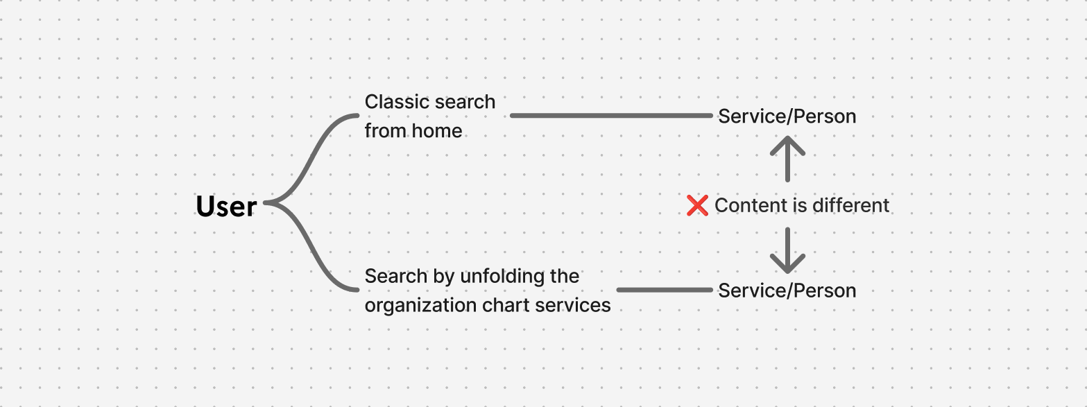
From Organizational Chart

From Detail panel

For example, the same service can display different information depending on the entry point. Attributes such as the service name, organizational hierarchy, and description are be inconsistent.
Graph behaviour

- The chart displays the root level by default.
- Users can expand nodes to explore sub-levels and click a node to open its service panel.
- The number on each node indicates the number of sub-levels.
- Only two levels are displayed at a time to keep the hierarchy readable.
- Expanded nodes can be collapsed. The « Show Tree » action displays the parent hierarchy and can be hidden to return to the default view.
Synchronizing Missing Information

When information is missing in MAIA, the available action depends on the service level.
A cross icon indicates that the service is not linked to ASP data and requires synchronization.
- Levels 1–2: No action available.
- Level 3: Users manually enter the service name and validate it.
- Level 4+: Users select the best matching service from a correspondence table ranked by compatibility.
Alerts
- Unlinked services: Displayed as clickable links and can be filtered.
- Services without a parent: Displayed as a clickable list, similar to unlinked services.